library(tidyverse)

measles_raw <- read_csv(
  "https://datavizf25.classes.andrewheiss.com/projects/01-mini-project/data/measles_cases_year.csv"
)

# Create a new column with nicer region names. See the official WHO regions:
# https://en.wikipedia.org/wiki/List_of_WHO_regions
measles <- measles_raw |>
  mutate(region_nice = case_match(region,
    "AFRO" ~ "Africa",
    "AMRO" ~ "Americas",
    "EMRO" ~ "Eastern Mediterranean",
    "EURO" ~ "Europe",
    "SEARO" ~ "South-East Asia",
    "WPRO" ~ "Western Pacific"
))Mini project 1 feedback
FAQs
feedback
Hi everyone!
Great work with your first mini projects! You successfully took real world data, cleaned it up, made a plot with it, and told a story!
There have been a lot of similar comments/issues that have come up, so I’ve put them here so they’re all in one place.
First, I’ll load and clean the data so I can illustrate stuff below:
Warnings and messages
Your rendered document has warnings and package loading messages.
You should turn off those warnings and messages. See this and this for more about how.
Raw LLM output
Don’t replace the starter code with LLM-flavored code that you didn’t write. Don’t use code directly from LLMs.
I provided starter code that loads the data and adds a new column with nicer region names (e.g. turns SEARO into South-East Asia). You shouldn’t need to redo that with slightly different code (likely generated by ChatGPT or some other LLM).
Also, you shouldn’t be using code directly from LLMs with things like %>% instead of |> or summarise() instead of summarize() or na.rm = TRUE where it’s not necessary or .groups = "drop" where it’s not necessary or labels and text and titles that are written by an AI, and so on.
Remember this: LLMs are bad and dangerous for learning how to code in this class.
Figure in the document doesn’t match the standalone image
The image in the document doesn’t use the same dimensions as the one you saved with ggsave, so the text is squished and overlapping. Use chunk options to control its size.
At the end of the assignment, you needed to submit (1) the rendered .qmd file and (2) saved versions of your plot as a PDF and as a PNG. You did this with ggsave(), like so:
cases_regions <- measles |>
  group_by(year, region) |>
  summarize(total_cases = sum(measles_total))

# Make a plot
my_neat_plot <- ggplot(
  cases_regions, aes(x = year, y = total_cases, fill = region)
) +
  geom_col() +
  guides(fill = "none") +
  facet_wrap(vars(region), nrow = 1)

# Show the plot in the document
my_neat_plot

# Save the plot
ggsave("output.pdf", my_neat_plot, width = 9, height = 3)
ggsave("output.png", my_neat_plot, width = 9, height = 3)
If you do that ↑ you’ll get a saved PDF and PNG that are each 9 inches wide and 3 inches tall. I chose those arbitrarily here, but most of you tinkered with those numbers to make sure everything fit nicely (like, you purposely widened and shortened the plot to make sure everything fit nicely).
HOWEVER, notice that the plot that that chunk spits out is actually a square and not long and short like you hoped. That’s because ggsave() and Quarto chunks set their dimensions independently. Even though you told the figure to be 9×3 in ggsave(), it’ll show as a square in Quarto because the default image size there is 7×7 (see here).
To fix it, use chunk options to set the dimensions. Now it’ll show as 9×3:
```{r}
#| fig-width: 9
#| fig-height: 3

cases_regions <- measles |>
  group_by(year, region) |>
  summarize(total_cases = sum(measles_total))

# Make a plot
my_neat_plot <- ggplot(
  cases_regions, aes(x = year, y = total_cases, fill = region)
) +
  geom_col() +
  guides(fill = "none") +
  facet_wrap(vars(region), nrow = 1)

# Show the plot in the document
my_neat_plot

# Save the plot
ggsave("output.pdf", my_neat_plot, width = 9, height = 3)
ggsave("output.png", my_neat_plot, width = 9, height = 3)
```
Sorting and ordering
Consider sorting the regions by number of cases instead of alphabetically
Many of you made a plot like this:
cases_summarized <- measles |>
  group_by(region) |>
  summarize(total_cases = sum(measles_total))

ggplot(cases_summarized, aes(x = region, y = total_cases)) +
  geom_col()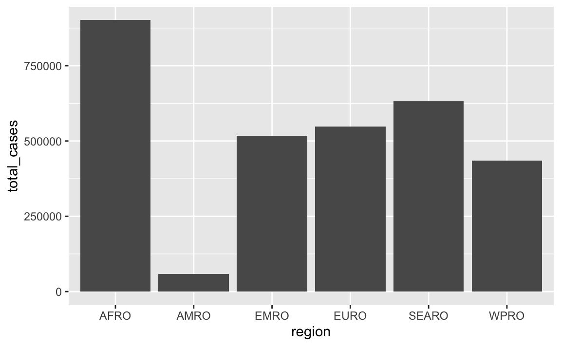
In that plot, the regions on the x-axis are in alphabetic order. If we want to tell a better story, though, it’s helpful to reorder them so that we can more easily see which regions have the most and least measles cases. See here for more about reordering categories. We can sort the data and then use fct_inorder() from the {forcats} package (also one of the nine that gets loaded with library(tidyverse)) to lock these region names in the right order:
cases_summarized <- measles |>
  group_by(region) |>
  summarize(total_cases = sum(measles_total)) |>
  # Sort by total in descending order
  arrange(desc(total_cases)) |>
  # Lock the region names in place
  mutate(region = fct_inorder(region))

ggplot(cases_summarized, aes(x = region, y = total_cases)) +
  geom_col()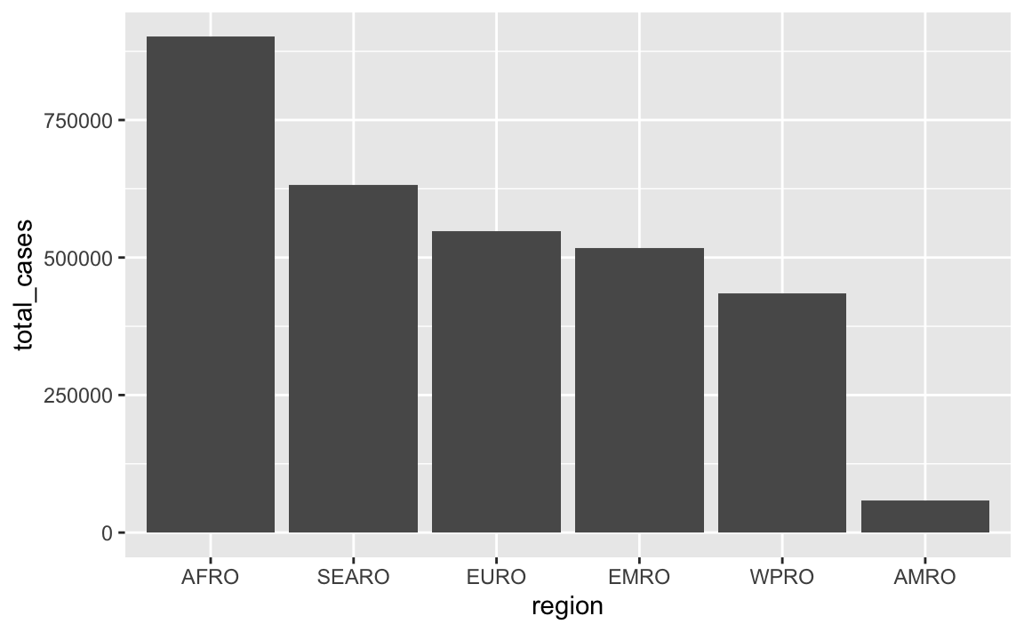
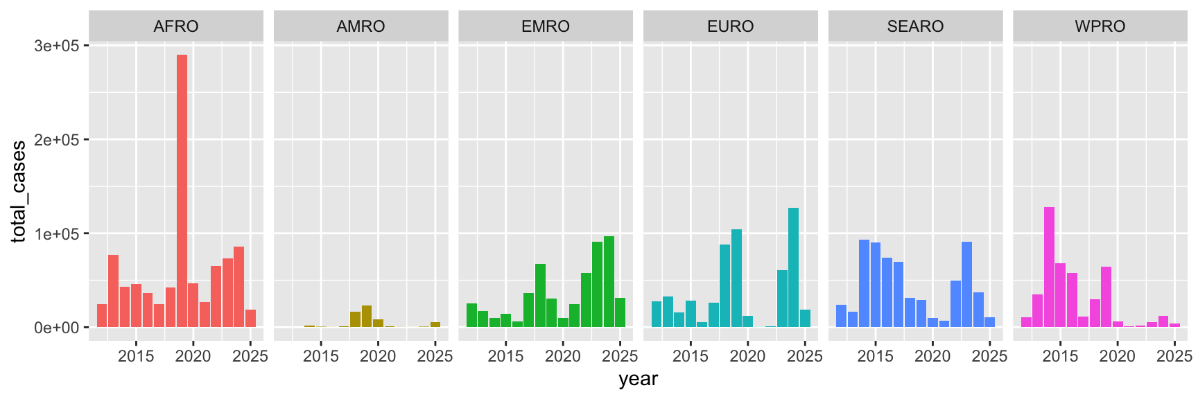
Unbalanced facets
The facets are a little unbalanced given that there are 8 panels. Consider adding… something?… to that empty panel, like explanatory text or information about the data source. Or make it use 4 columns and 2 rows, or 2 columns and 4 rows so there’s no empty space
Lots of you used facets. By default R tries to make the grid as square as possible, so here there are 3 rows and 3 columns, but that leaves an empty panel in the bottom right corner since there are only 8 panels:
cases_by_region_year <- measles |>
  filter(year >= 2018, year <= 2025) |>
  group_by(region, year) |>
  summarize(total_cases = sum(measles_total))

ggplot(cases_by_region_year, aes(x = region, y = total_cases)) +
  geom_col() +
  facet_wrap(vars(year))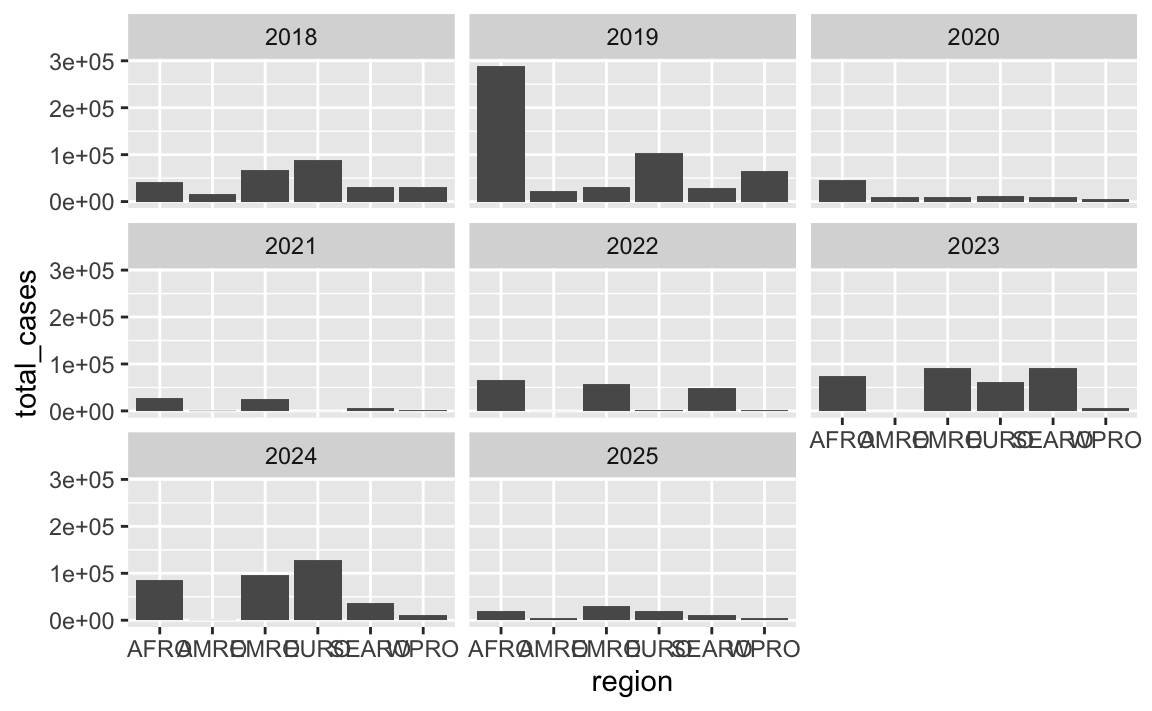
For the sake of balance, you can get rid of that panel by changing the layout. There are 8 panels here, so we could make a rectangle that’s 4 wide and 2 tall (or 2 wide and 4 tall if you want a tall rectangle instead) using the nrow or ncol arguments to facet_wrap():
ggplot(cases_by_region_year, aes(x = region, y = total_cases)) +
  geom_col() +
  facet_wrap(vars(year), ncol = 4)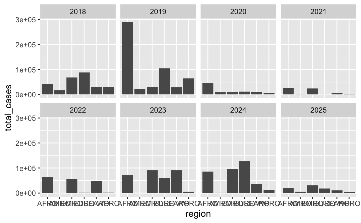
ggplot(cases_by_region_year, aes(x = region, y = total_cases)) +
  geom_col() +
  facet_wrap(vars(year), nrow = 4)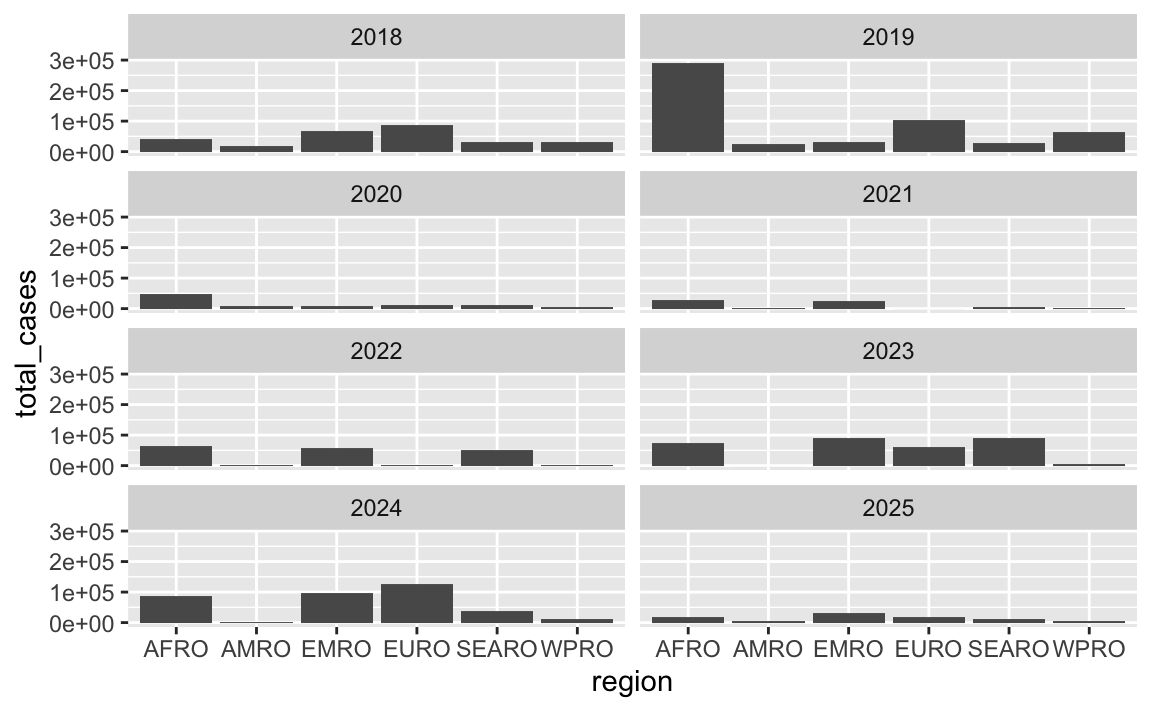
Alternatively you can stick something in that empty panel like your legend (though in this example it’s better to not even have a legend because it’s redundant with the x-axis). The reposition_legend() function from the {lemon} package makes this really easy:
library(lemon)

p <- ggplot(cases_by_region_year, aes(x = region, y = total_cases, fill = region)) +
  geom_col() +
  facet_wrap(vars(year), ncol = 3) +
  guides(fill = guide_legend(ncol = 2, title.position = "top"))

reposition_legend(p, position = "bottom left", panel = "panel-3-3")
You can even be fancy and add some explanatory text to that corner. It takes a big of extra work—you essentially have to create a fake text-only plot using grid::textGrob() and then use inset_element() from the {patchwork} to place it on top of the main plot:
library(grid)  # For making custom grid grobs
library(patchwork)

# Make a little text-only plot
extra_note <- textGrob(
  "Here's some text\nabout stuff. Neato.",
  gp = gpar(fontface = "bold")
)

# Run this if you want to see it by itself:
# grid.draw(extra_note)

p <- ggplot(cases_by_region_year, aes(x = region, y = total_cases)) +
  geom_col() +
  facet_wrap(vars(year), ncol = 3)

# Add the text-only plot as an inset plot with patchwork
p + inset_element(extra_note, left = 0.7, bottom = 0.0, right = 1, top = 0.3)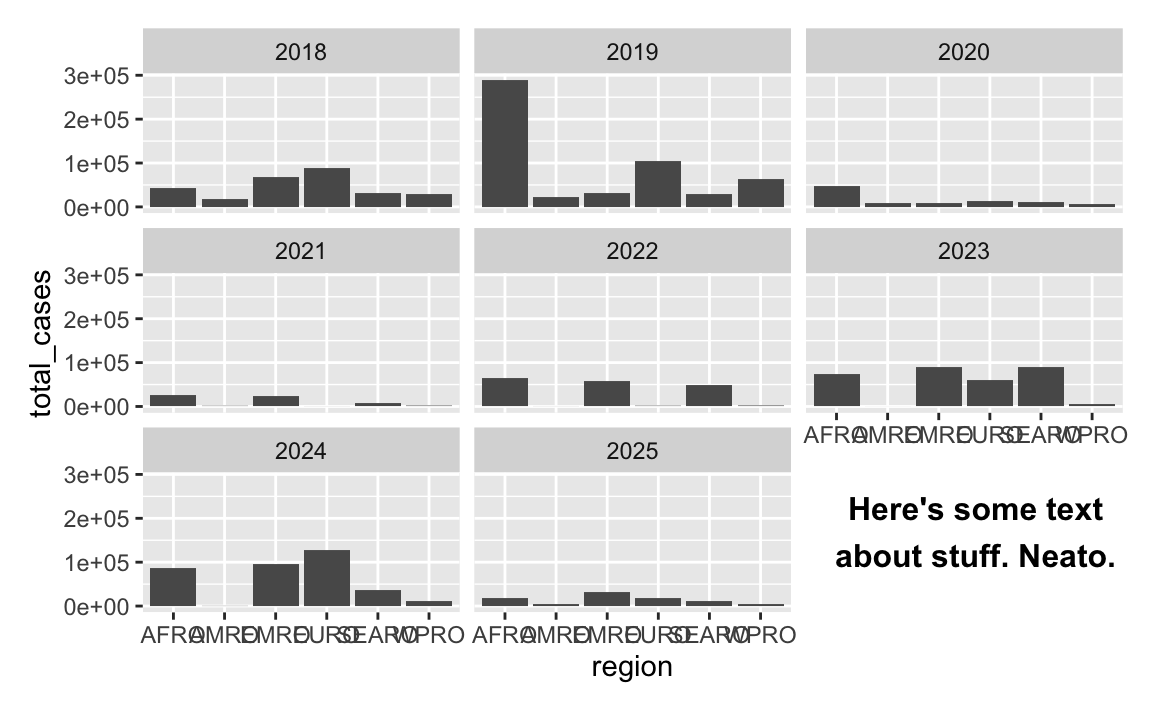
Overlapping text
The labels along the x-axis are unreadable and overlapping.
There are lots of ways to fix this—see this whole blog post for some different options. Here are some quick examples (none of these are fabulous, but they’re a start):
ggplot(cases_by_region_year, aes(x = total_cases, y = region)) +
  geom_col() +
  facet_wrap(vars(year), ncol = 4)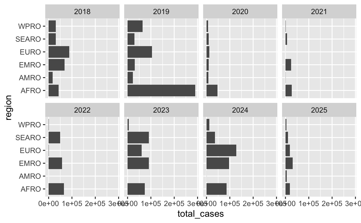
ggplot(cases_by_region_year, aes(x = region, y = total_cases)) +
  geom_col() +
  facet_wrap(vars(year), ncol = 4) +
  theme(axis.text.x = element_text(angle = 30, hjust = 0.5, vjust = 0.5))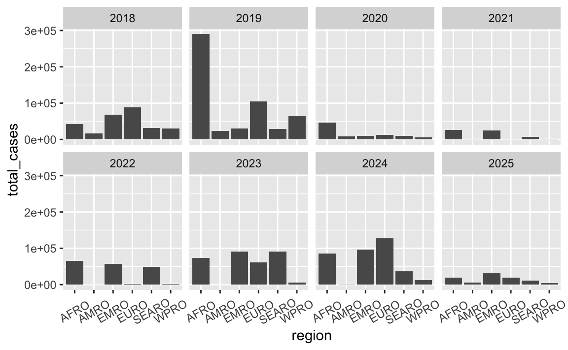
ggplot(cases_by_region_year, aes(x = region, y = total_cases)) +
  geom_col() +
  facet_wrap(vars(year), ncol = 4) +
  scale_x_discrete(guide = guide_axis(n.dodge = 3))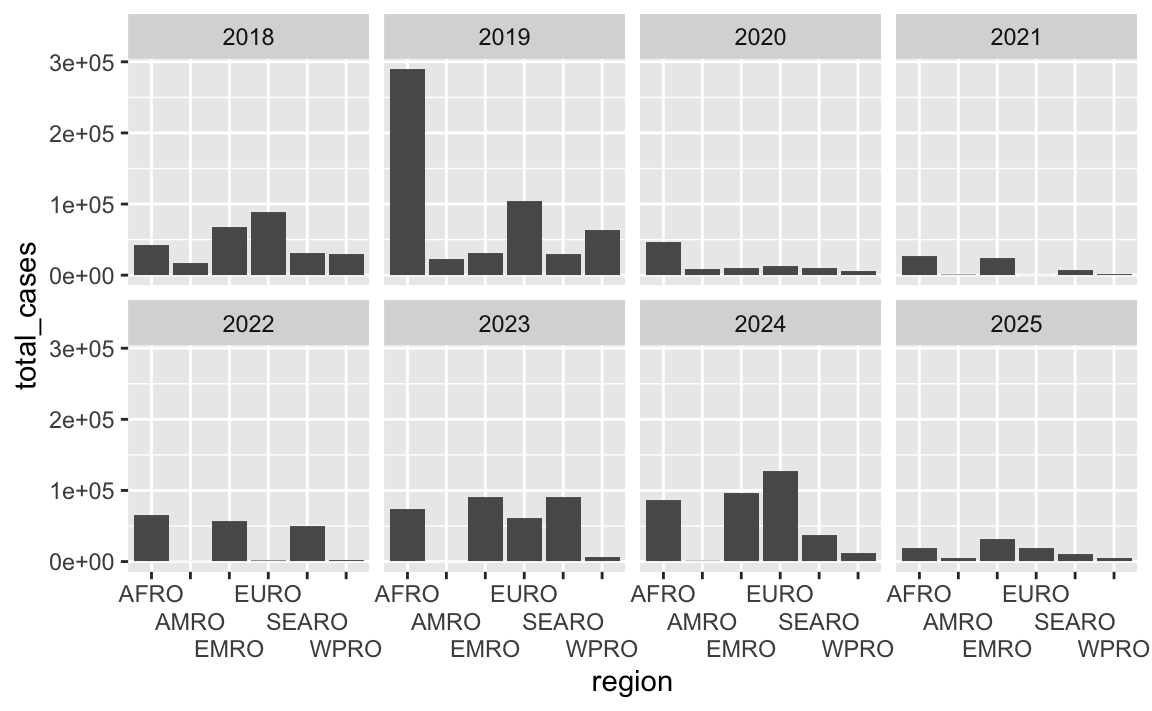
Commas
Consider adding automatic commas to the x-axis by including
library(scales)and addingscale_x_continuous(labels = label_comma())
You can make nicer labels by formatting them with label_comma() (or any of the other label_*() functions) from the {scales} package. See this FAQ question for more about different formatting functions.
library(scales)

ggplot(cases_summarized, aes(x = region, y = total_cases)) +
  geom_col() +
  scale_y_continuous(labels = label_comma())
Omit time-based axis titles
You can safely remove the “Year” label since it’s obvious those are years
Generally speaking, if you have a date along an axis, you can safely remove the axis title because it’s obvious that those are dates.
For instance, here’s a line showing total cases over time globally:
cases_over_time <- measles |>
  group_by(year) |>
  summarize(total_cases = sum(measles_total))

ggplot(cases_over_time, aes(x = year, y = total_cases)) +
  geom_line() +
  labs(title = "Global measles cases over time")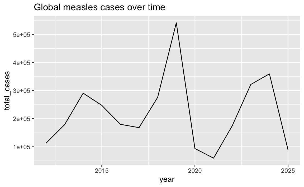
Since it’s obvious from the title and from the years themselves that the x-axis contains years, we can remove that title and gain a little bit of vertical space:
ggplot(cases_over_time, aes(x = year, y = total_cases)) +
  geom_line() +
  labs(x = NULL, title = "Global measles cases over time")
Remove redundant legends
You can safely remove the legend because those details are already included in the plot itself.
You can often save a ton of space in a plot by removing the legend (when appropriate!). For instance, here we have a plot of cases over time in each region, with lines colored by region:
ggplot(cases_by_region_year, aes(x = year, y = total_cases, color = region)) +
  geom_line() +
  facet_wrap(vars(region))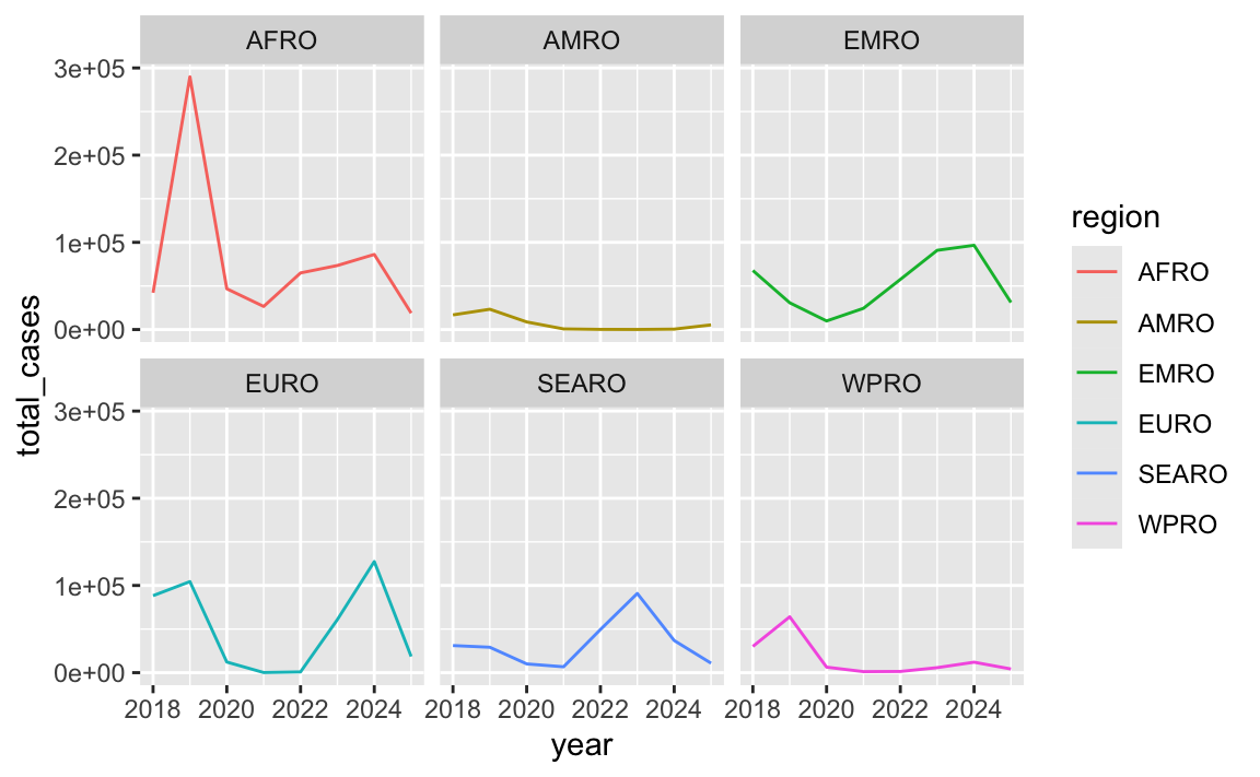
There’s no need for a legend here because those region acronyms are in the facet titles. We can safely remove it:
ggplot(cases_by_region_year, aes(x = year, y = total_cases, color = region)) +
  geom_line() +
  guides(color = "none") +
  facet_wrap(vars(region))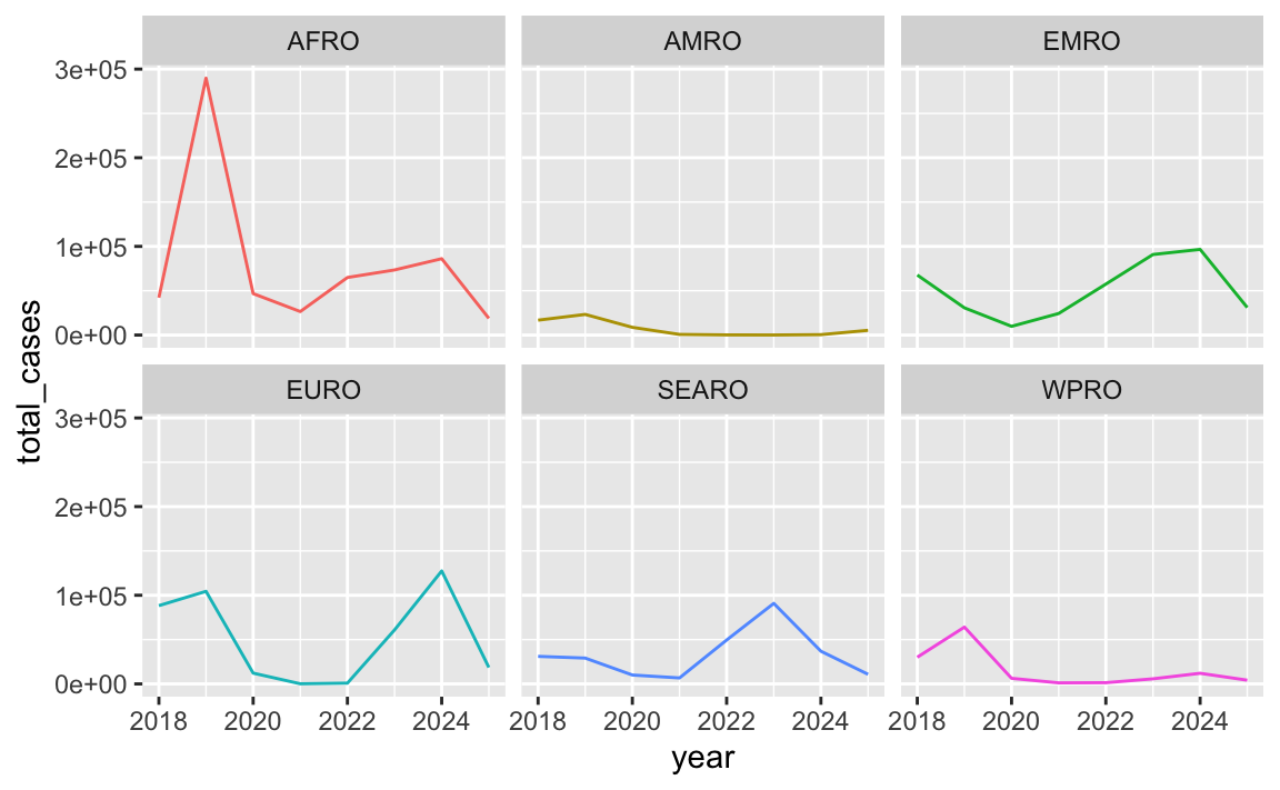
Format code more consistently
Try following R style guide suggestions to make the code more readable (and writable)
R is pretty forgiving about processing code that has mismatched indents, extra spaces, lack of spaces around =s, really long lines, and so on, but there are some general guidelines that you should follow to make the code more readable and manageable. See this page.
If you want to automate code styling, check out the new Air formatter, which you can configure RStudio to use by following these instructions. Once you set that up, you can select code and type to automatically reformat it using the tidyverse style guide.