Am I telling R what to do with my code, or is it telling me what to do? Who’s in charge? Why isn’t it listening?!
This can be frustrating! You’ll type some code, thinking that it’s what you need to write to make a plot, and then nothing works.
Computers are incredibly literal and they cannot read your mind!
As humans we’re good at figuring out information when data is missing or distorted—if someone sends you a text saying that they’re “running 5 minutes latte”, you know that they’re not running with some weird time-based coffee but are instead running late. Computers can’t figure that out and they’d think you’re talking about a literal latte.
For example, in Exercise 5, you made a plot that shows the county of cheese types across country and animal milk types. You might try doing something like this, but it won’t work:
ggplot( cheeses_milk_country,aes(x = Total, y = Country, fill ="Animal type")) +geom_col()#> Error in `geom_col()`:#> ! Problem while computing aesthetics.#> ℹ Error occurred in the 1st layer.#> Caused by error:#> ! object 'Total' not found
That won’t work because:
There’s no column named Total. It’s total with a lowercase t.
There’s no column maed Country. It’s country with a lowercase c.
There’s no column named Animal type. It’s called milk. Also, "Animal type" is in quotes, so even if there was a column named that, it wouldn’t fill the bars by the different animal types—it would make them all the same color. It needs to be fill = milk.
In the end, it needs to look like this:
ggplot( cheeses_milk_country,aes(x = total, y = country, fill = milk)) +geom_col()
In this case, you started by telling R what you wanted, but it was wrong, so R is (kind of) telling you what to do to fix it.
Again, R can’t read your mind, so it won’t give you a message like “You used Animal type, but based on your data it looks like you might want to use the milk column instead.” Computers aren’t that smart. All it tells you is that the column you told it to use doesn’t exist. It’s your job to fix it somehow.
R does try to be more helpful when it can, though!
Like, let’s say you forget that you need to use + in between ggplot layers and you use a pipe (|>) instead (remember the difference here).
ggplot( cheeses_milk_country,aes(x = total, y = country, fill = milk)) |>geom_col()#> Error in `geom_col()`:#> ! `mapping` must be created by `aes()`.#> ✖ You've supplied a <ggplot2::ggplot> object.#> ℹ Did you use `%>%` or `|>` instead of `+`?
R will give you a cryptic error, but it will also give you a helpful hint: “Did you use %>% or |> instead of +?” That’s R trying to work with you—switch the |> to a + and you should be good to go!
In the end, you’re in charge—you’re telling R what you want it to do. But you have to tell it in a way that it understands. It’ll try to help where possible, but you still need to learn how to talk to it.
Do I really need to make fancy custom themes for every plot? Aren’t theme_bw() or theme_gray() just fine?
The built in default themes like theme_gray(), theme_bw(), theme_minimal() and so on are generally well designed and work well and it’s totally fine and normal to just use those, or use them with a little bit of minor modification. You’ll rarely need to spend tons of time tinkering with {ggThemeAssist} to make a completely new theme for every plot you make.
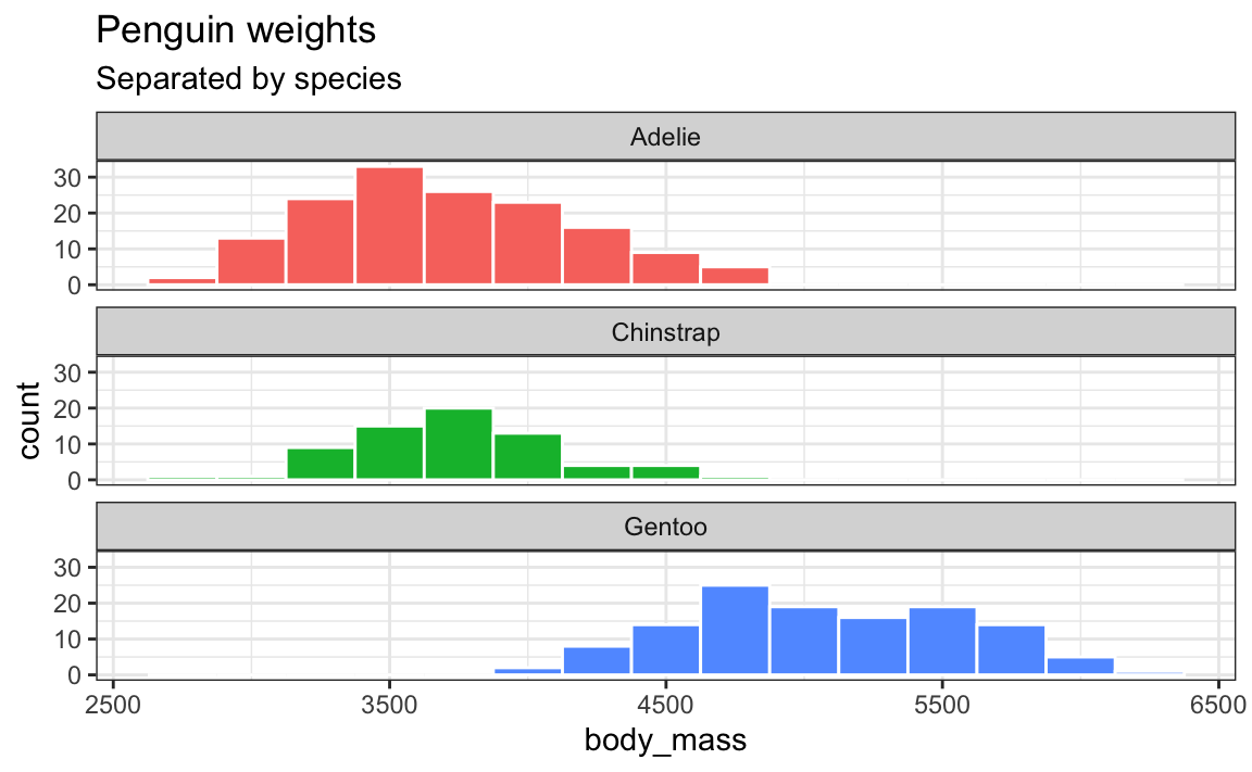
In the majority of my own work, I’ll just use theme_minimal() or theme_bw() or theme_light() with a few little changes. Like, here’s a plot with theme_bw():
ggplot(penguins, aes(x = body_mass, fill = species)) +geom_histogram(binwidth =250, color ="white") +guides(fill ="none") +labs(title ="Penguin weights", subtitle ="Separated by species") +facet_wrap(vars(species), ncol =1) +theme_bw()
That’s all great, but I have a few tiny design quibbles with it:
There’s not a lot of contrast in the title area—it’d be nice if things were bold or something
There’s not a lot of contrast in alignments. The panel titles and axis titles are centered while the plot title and subtitle are left aligned
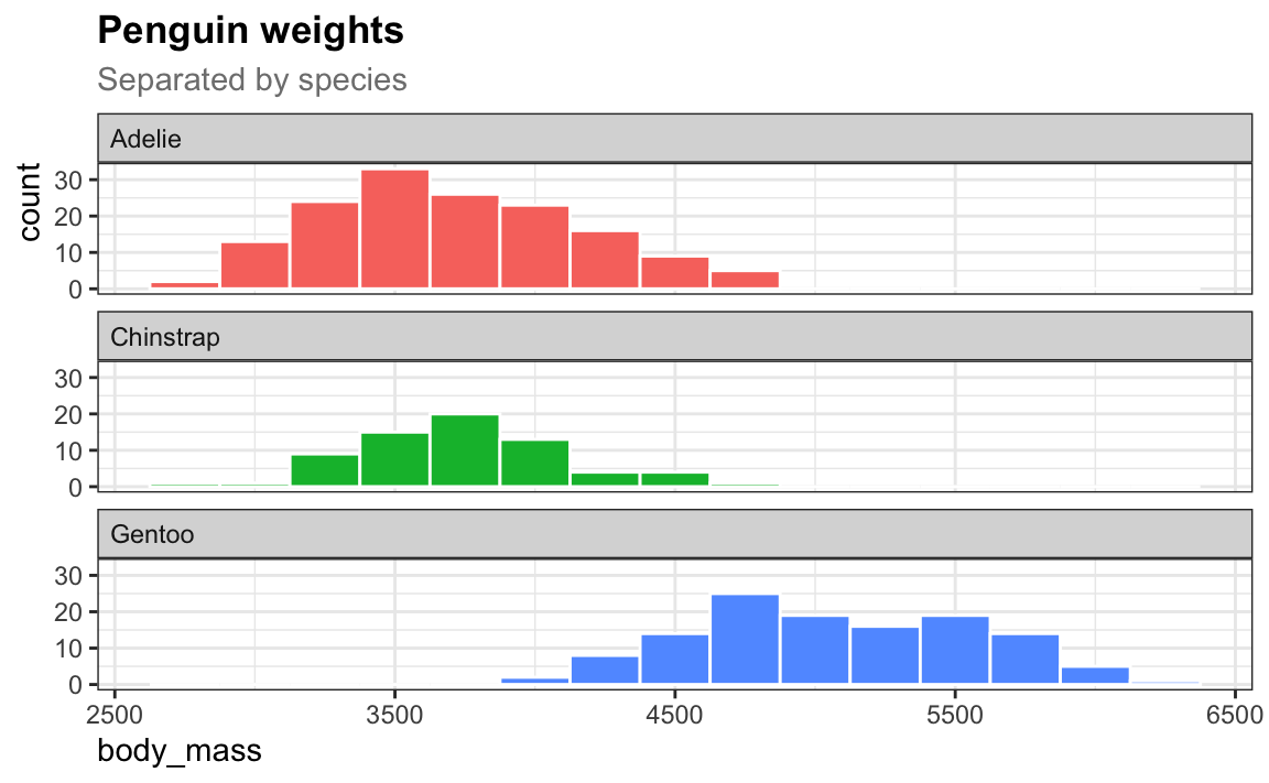
Now there’s good repetition with the alignments and good contrast in the title area.
I’ll use that same theme throughout a project. Typing all those little theme tweaks is annoying, but you can reuse them—see this FAQ from week 5!
# Make a slightly modified version of theme_bw()my_theme <-theme_bw() +theme(plot.title =element_text(face ="bold"),plot.subtitle =element_text(color ="gray50"),axis.title.x =element_text(hjust =0),axis.title.y =element_text(hjust =1),strip.text =element_text(hjust =0) )# Make all future plots in the document use my_themetheme_set(my_theme)
Now for the rest of my document or project, I don’t need to think about adding a theme layer to my plots. Every plot will automatically use my_theme:
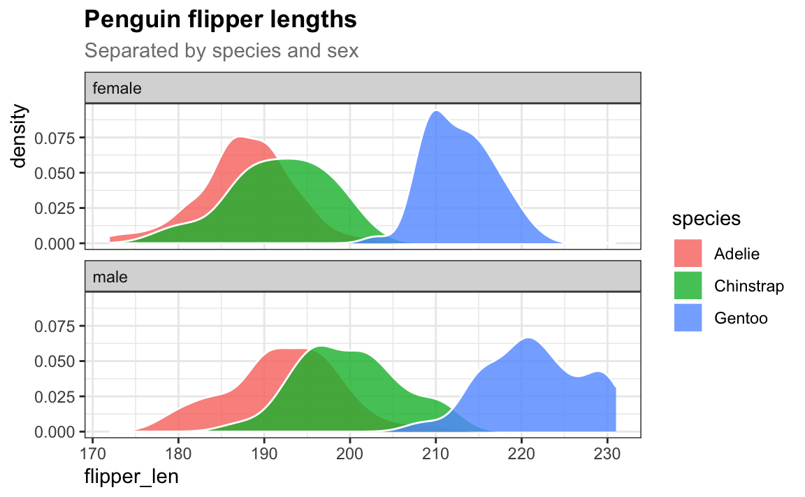
# Here's a completely new plot that uses my_theme automatically!penguins |>drop_na(sex) |>ggplot(aes(x = flipper_len, fill = species)) +geom_density(alpha =0.8, color ="white") +labs(title ="Penguin flipper lengths", subtitle ="Separated by species and sex") +facet_wrap(vars(sex), ncol =1)
I have numbers like 20000 and want them formatted with commas like 20,000. Can I do that automatically?
Yes you can! There’s an incredible package called {scales}. It lets you format numbers and axes and all sorts of things in magical ways. If you look at the documentation, you’ll see a ton of label_SOMETHING() functions, like label_comma(), label_dollar(), and label_percent().
You can use these different labeling functions inside scale_AESTHETIC_WHATEVER() layers in ggplot.
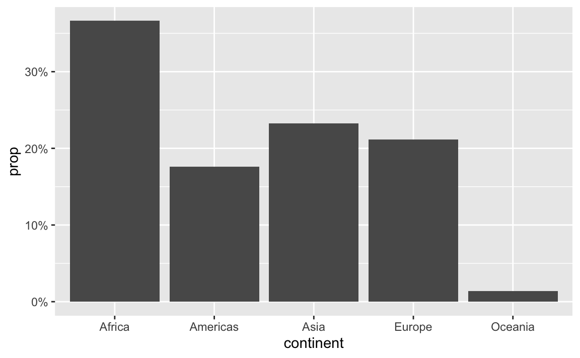
label_percent() multiplies values by 100 and formats them as percents:
gapminder_percents <- gapminder_2007 |>group_by(continent) |>summarize(n =n()) |>mutate(prop = n /sum(n))ggplot(gapminder_percents, aes(x = continent, y = prop)) +geom_col() +scale_y_continuous(labels =label_percent())
You can also change a ton of the settings for these different labeling functions. Want to format something as Euros and use periods as the number separators instead of commas, like Europeans? Change the appropriate arguments! You can check the documentation for each of the label_WHATEVER() functions to see what you can adjust (like label_dollar() here)
All the label_WHATEVER() functions actually create copies of themselves, so if you’re using lots of custom settings, you can create your own label function, like label_euro() here:
# Make a custom labeling functionlabel_euro <-label_dollar(prefix ="€", big.mark =".")# Use it on the x-axisggplot(gapminder_2007, aes(x = gdpPercap)) +geom_histogram(binwidth =1000) +scale_x_continuous(labels = label_euro)
These labeling functions also work with other aesthetics, like fill and color and size. Use them in scale_AESTHETIC_WHATEVER():
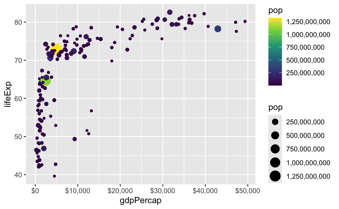
There are also some really neat and fancy things you can do with scales, like formatting logged values, abbreviating long numbers, and many other things. Check out this post for an example of working with logged values.
ggplot( gapminder_2007,aes(x = gdpPercap, y = lifeExp, size = pop, color = continent)) +geom_point() +scale_x_log10(breaks =500*2^seq(1, 9, by =1),labels =label_dollar(scale_cut =append(scales::cut_short_scale(), 1, 1)) ) +scale_size_continuous(labels =label_comma(scale_cut =cut_short_scale()))
I tried using {gghalves} and geom_half_point() but I got an error?
A bunch of you got this error when using {gghalves}:
#> Error in geom_half_point() : #> ℹ Error occurred in the 1st layer.#> Caused by error in fun():#> ! argument "layout" is missing, with no default
(One big update is some improvements in how theme() works—see here for more—though that’s unrelated to this {gghalves} issue.)
Something in the latest version of {ggplot2} broke something in {gghalves}, and other people noticed it and reported it as a bug here. If you recently installed or updated ggplot, your {gghalves} is broken.
One of the main ggplot developers made a copy of {gghalves} and fixed the issue, though. The fix hasn’t been incorporated into the main {gghalves} package yet, but you can install his version by (1) restarting your R session, and (2) running this:
That’ll replace the normal version of {gghalves} with the fixed version for ggplot 4.0. Eventually the {gghalves} developer will merge those changes into the main package, but this works for now!
My histogram bars are too wide / too narrow / not visible. How do I fix that?
In exercise 6, a lot of you ran into issues with the spending-per-child histogram. The main issue was related to bin widths.
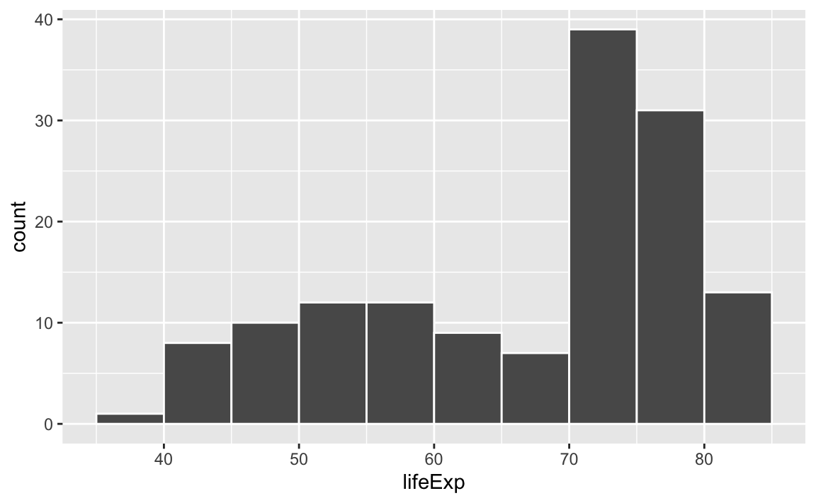
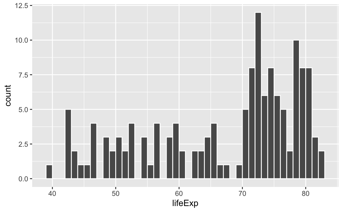
Histograms work by taking a variable, cutting it up into smaller buckets, and counting how many rows appear in each bucket. For example, here’s a histogram of life expectancy from gapminder, with the binwidth argument set to 5:
The binwidth = 5 setting means that each of those bars shows the count of countries with life expectancies in five-year buckets: 35–40, 40–45, 45–50, and so on.
If we change that to binwidth = 1, we get narrower bars because we have smaller buckets—each bar here shows the count of countries with life expectancies between 50–51, 51–52, 52–53, and so on.
ggplot(gapminder_2007, aes(x = lifeExp)) +geom_histogram(binwidth =1, color ="white", boundary =0)
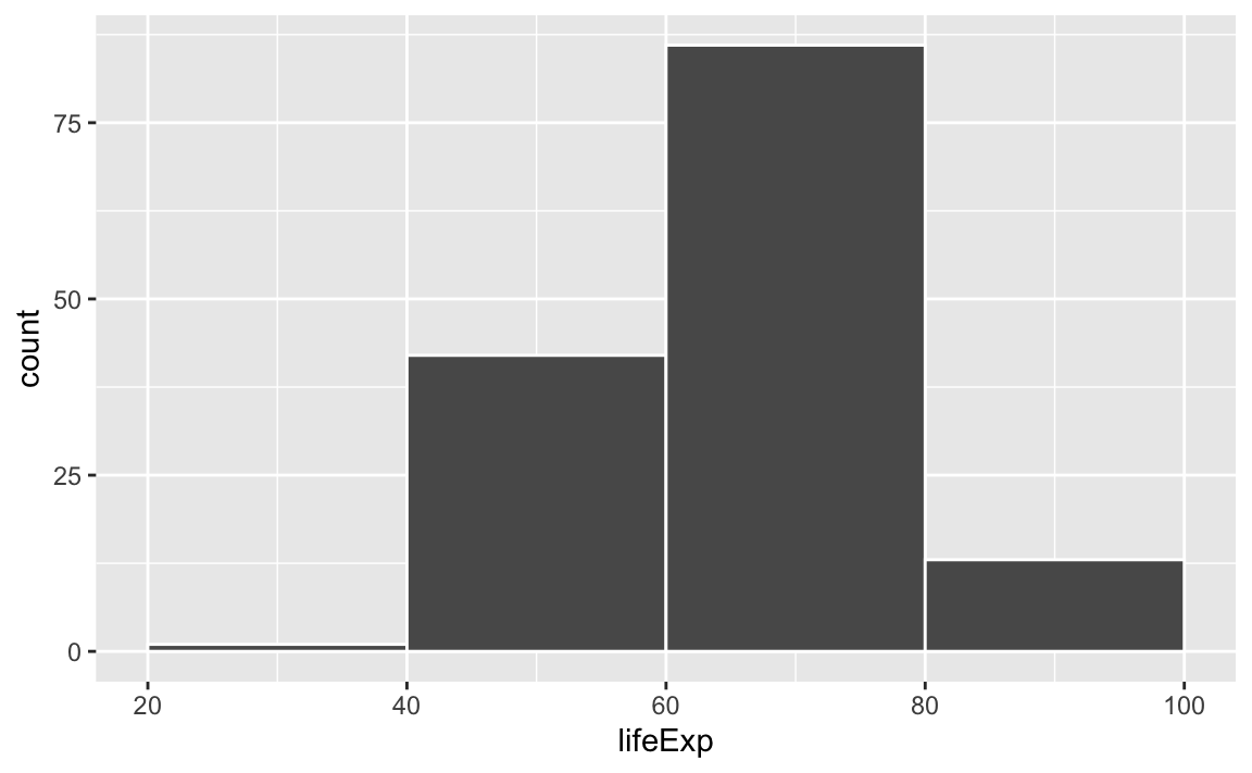
If we change it to binwidth = 20, we get huge bars because the buckets are huge. Now each bar shows the count of countries with life expectancies between 20–40, 40–60, 60–80, and 80–100:
ggplot(gapminder_2007, aes(x = lifeExp)) +geom_histogram(binwidth =20, color ="white", boundary =0)
There is no one correct good universal value for the bin width and it depends entirely on your data.
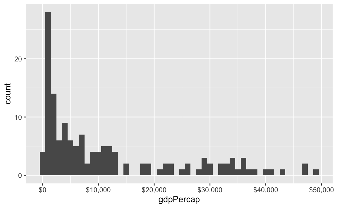
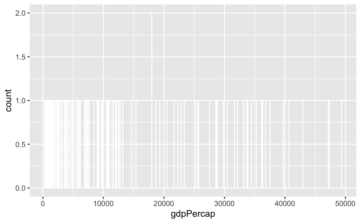
Lots of you ran into an issue when copying/pasting code from the example, where one of the example histograms used binwidth = 1, since that was appropriate for that variable.
Watch what happens if you plot a histogram of GDP per capita using binwidth = 1:
ggplot(gapminder_2007, aes(x = gdpPercap)) +geom_histogram(binwidth =1, color ="white", boundary =0)
haha yeah that’s delightfully wrong. Each bar here is showing the count of countries with GDP per capita is $10,000–$10,001, then $10,001–$10.002, then $10,002–$10,003, and so on. Basically every country has its own unique GDP per capita, so the count for each of those super narrow bars is 1 (there’s one exception where two countries fall in the same bucket, which is why the y-axis goes up to 2). You can’t actually see any of the bars here because they’re too narrow—all you can really see is the white border around the bars.
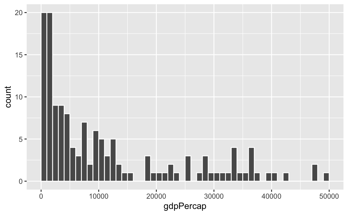
To actually see what’s happening, you need a bigger bin width. How much bigger is up to you. With life expectancy we played around with 1, 5, and 20, but those bucket sizes are waaaay too small for GDP per capita. Try bigger values instead. But again, there’s no right number here!
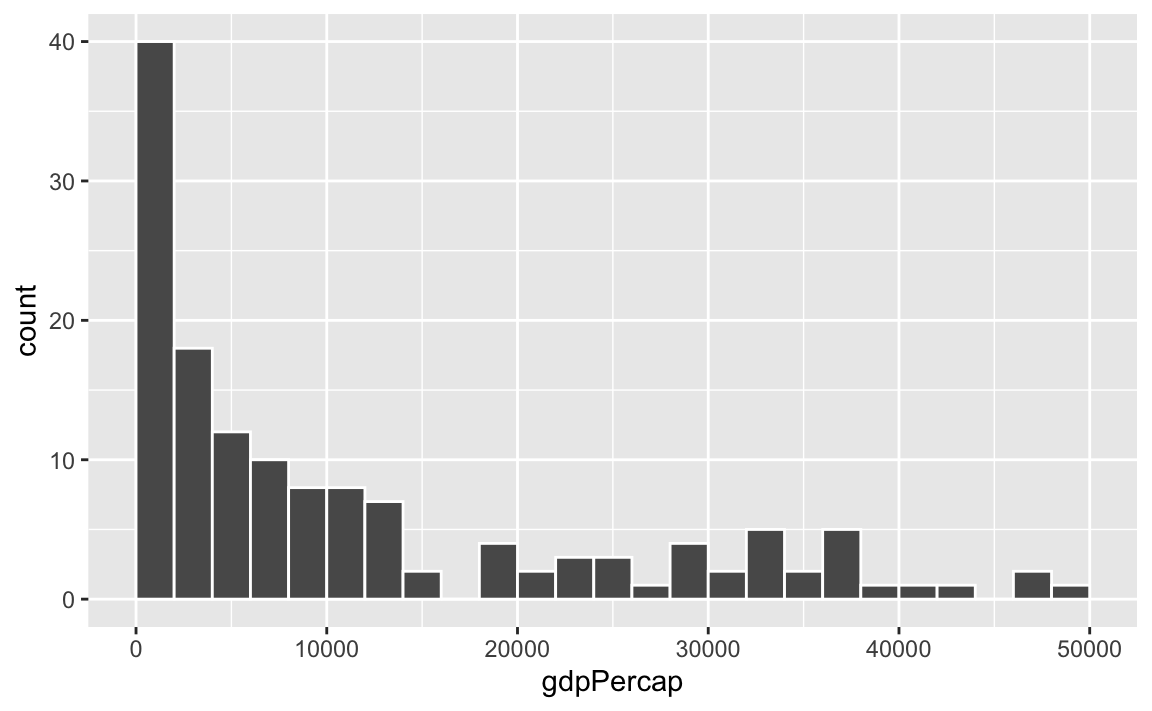
ggplot(gapminder_2007, aes(x = gdpPercap)) +geom_histogram(binwidth =1000, color ="white", boundary =0)
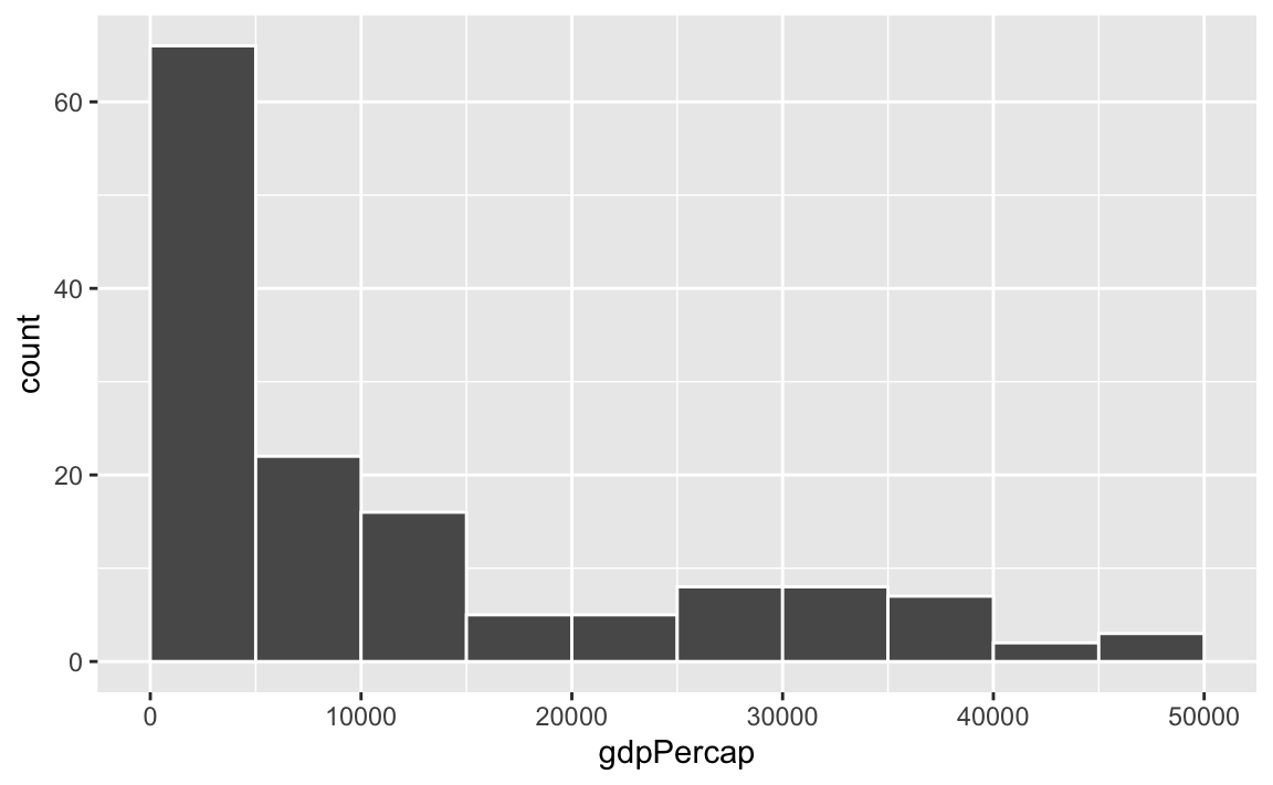
ggplot(gapminder_2007, aes(x = gdpPercap)) +geom_histogram(binwidth =2000, color ="white", boundary =0)
ggplot(gapminder_2007, aes(x = gdpPercap)) +geom_histogram(binwidth =5000, color ="white", boundary =0)
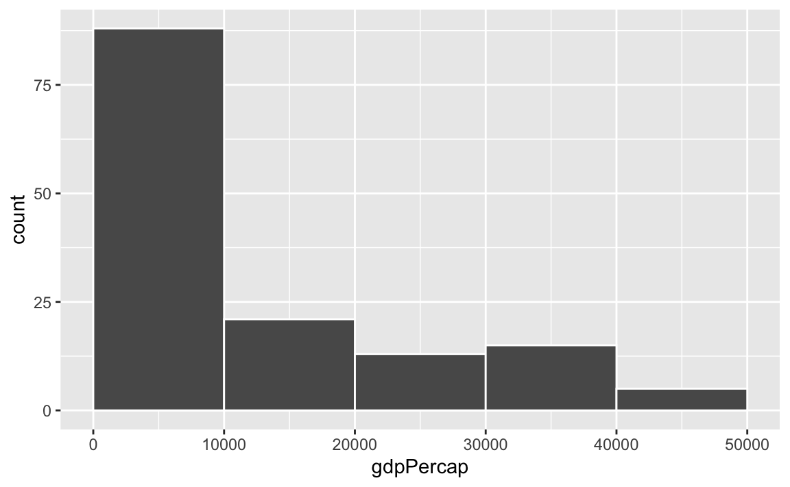
ggplot(gapminder_2007, aes(x = gdpPercap)) +geom_histogram(binwidth =10000, color ="white", boundary =0)
Does it matter which order we put the different layers in?
So far this semester, most of your plots have involved one or two geom_* layers. At one point in some video (I think), I mentioned that layer order doesn’t matter with ggplot. These two chunks of code create identical plots:
All those functions can happen in whatever order you want, with one exception. The order of the geom layers matters. The first geom layer you specify will be plotted first, the second will go on top of it, and so on.
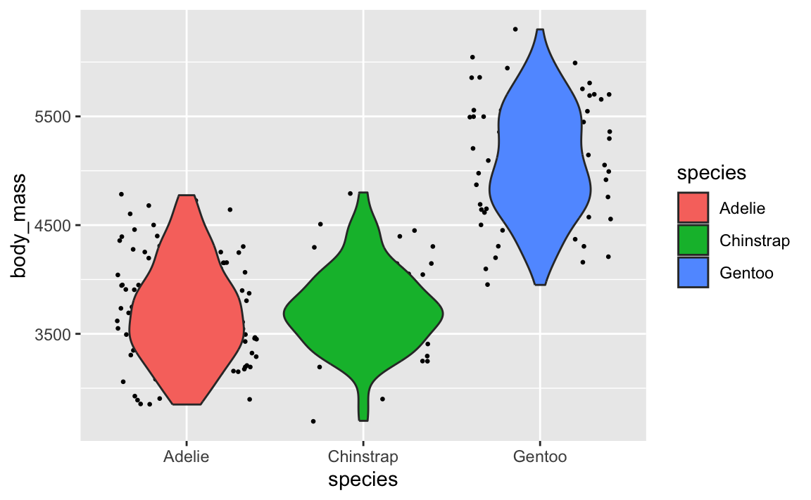
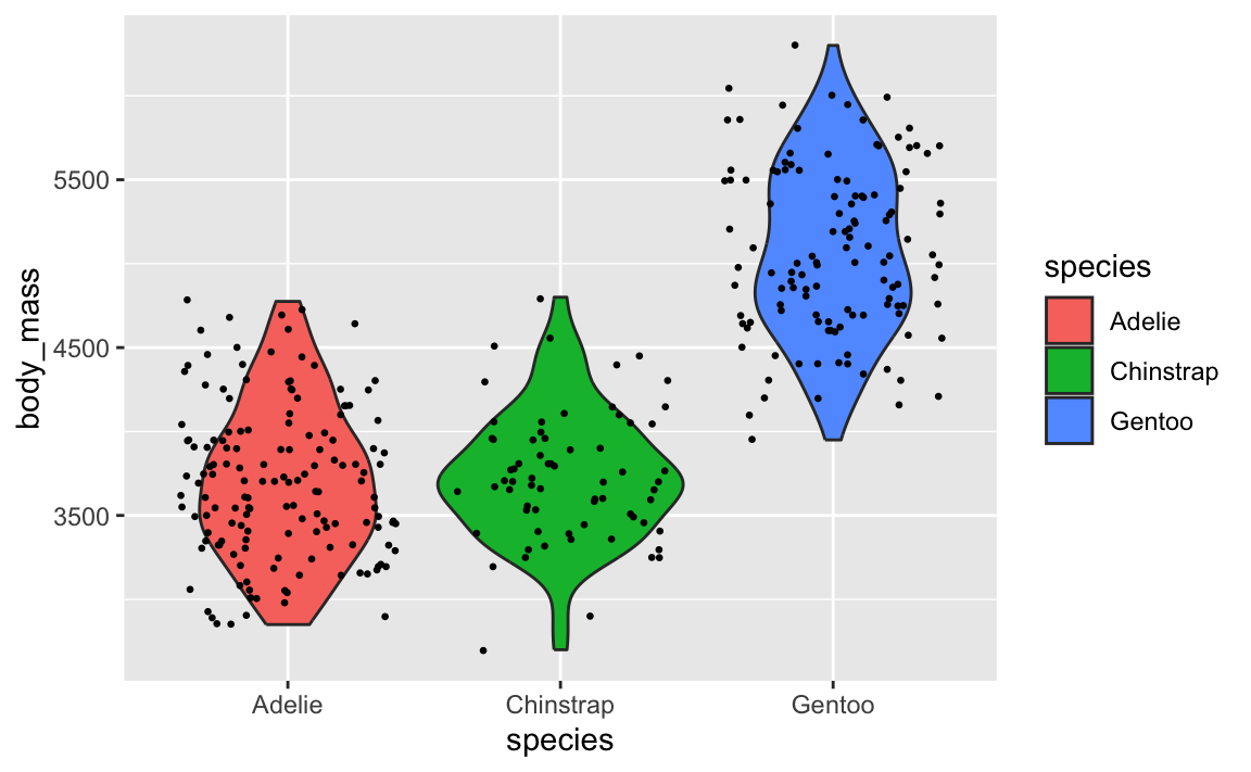
Let’s say you want to have a violin plot with jittered points on top. If you put geom_point() first, the points will be hidden by the violins:
When I make my plots, I try to keep my layers in logical groups. I’ll do my geoms and annotations first, then scale adjustments, then guide adjustments, then labels, then facets (if any), and end with theme adjustments, like this:
This is totally arbitrary though! All that really matters is that the geoms and annotations are in the right order and that any theme adjustments you make with theme() come after a more general theme like theme_grey() or theme_minimal(), etc.. I’d recommend you figure out your own preferred style and try to stay consistent—it’ll make your life easier and more predictable.