There are so many ggplot-specific R packages—how can we remember them or find them all?
A couple weeks ago there was a related FAQ about all R packages, and I gave you some helpful strategies for finding R packages in general.
There are also a ton of packages related to {ggplot2} itself. How do you find those? How do I know about things like {ggridges} and {ggdist} and whatnot?
What’s the difference between labs() and annotate(geom = "text")?
The short version: labs() lets you put text in specific areas around the plot; annotate() lets you add one item of text somewhere in the plot.
The labs() function controls how all sorts of outside-of-the-plot text appears. You can use it to control two general categories of things:
The title for any aesthetic you set in aes(), like the x- and y-axis labels or things in the legend (e.g., if you have aes(x = THING, size = BLAH, color = BLOOP), you can do labs(x = "Some variable", size = "Something", color = "Something else")).
The title, subtitle, caption, and tag. You haven’t really seen tags yet in the class—they’re mostly for adding little numbers of letters so you can write things like “In panel A of figure 1”, and they’re really helpful if you’re using {patchwork} to combine plots.
As you learned in the lesson, annotate() lets you add one single geom inside the plot without needing any data mapped to it. You supply the data yourself.
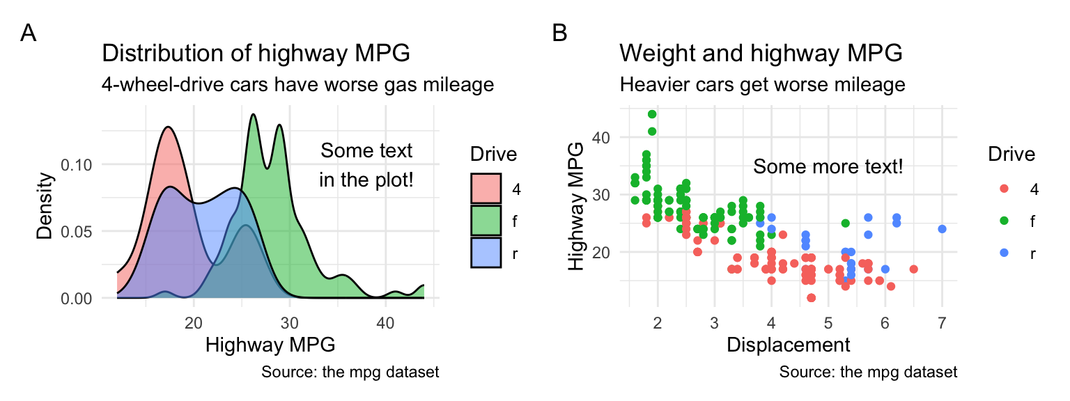
Here’s an example showing both: annotate() adds arbitrary text at specific points in the plots, labs() deals with stuff outside the plot, like the axis labels, titles, and legend names (and this shows tag in action too):
library(tidyverse)library(patchwork)p1 <-ggplot(mpg, aes(x = hwy, fill = drv)) +geom_density(alpha =0.5) +# Here's some arbitrary text *inside* the plotannotate(geom ="text", x =38, y =0.10, label ="Some text\nin the plot!" ) +# Here's some text *outside* the plotlabs(# These are all aesthetics that we set with aes()x ="Highway MPG", y ="Density", fill ="Drive",# These are general title-y thingstitle ="Distribution of highway MPG",subtitle ="4-wheel-drive cars have worse gas mileage",caption ="Source: the mpg dataset",tag ="A" ) +theme_minimal()p2 <-ggplot(mpg, aes(x = displ, y = hwy, color = drv)) +geom_point() +# Here's some arbitrary text *inside* the plotannotate(geom ="text", x =5, y =35, label ="Some more text!") +# Here's some text *outside* the plotlabs(# These are all aesthetics that we set with aes()x ="Displacement", y ="Highway MPG", color ="Drive",# These are general title-y thingstitle ="Weight and highway MPG",subtitle ="Heavier cars get worse mileage",caption ="Source: the mpg dataset",tag ="B" ) +theme_minimal()p1 | p2
What’s the difference between geom_text() and annotate(geom = "text")?
The short version: geom_text() puts text on every point in the dataset; annotate() lets you add one item of text somewhere in the plot.
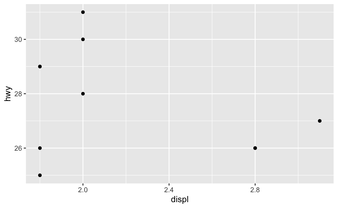
All the different geom_*() functions show columns from a dataset mapped onto some aesthetic. You have to have set aesthetics with aes() to use them, and you’ve been using things like geom_point() all semester:
# Just use the first ten rows of mpgmpg_small <- mpg |>slice(1:10)ggplot(mpg_small, aes(x = displ, y = hwy)) +geom_point()
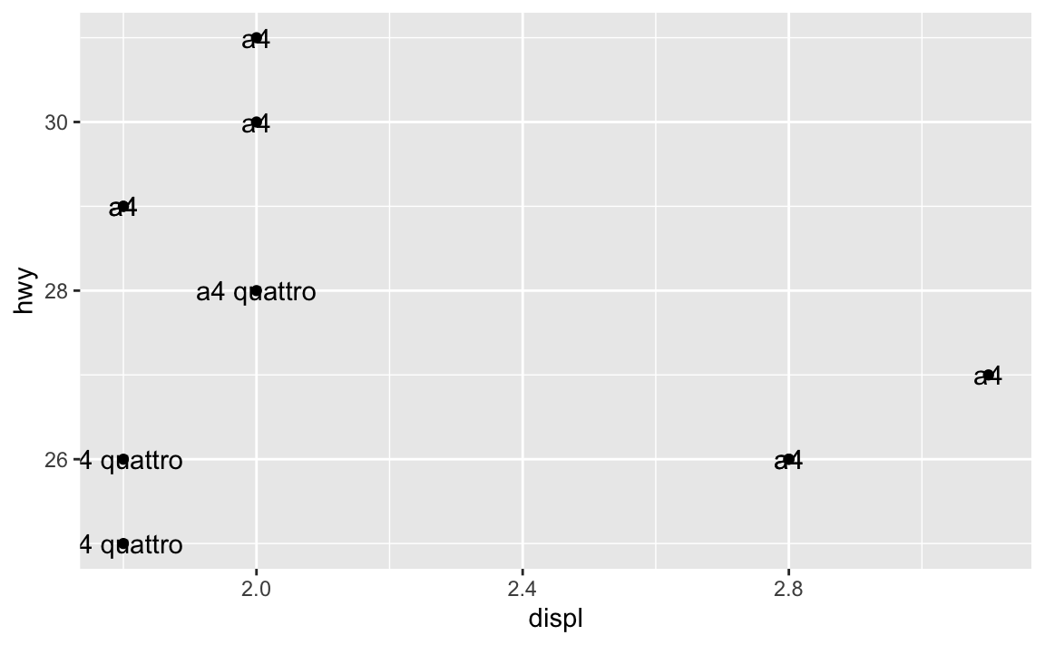
If we add geom_text(), we’ll get a label at every one of these points. Essentially, geom_text() is just like geom_point(), but instead of adding a point, it adds text.
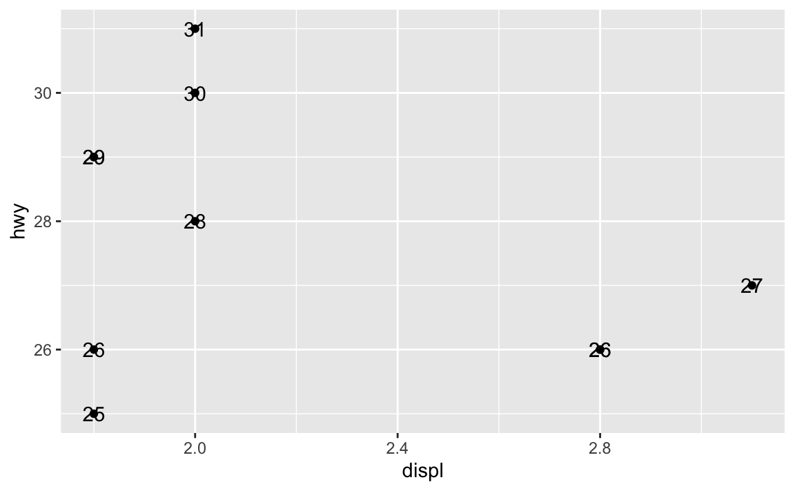
Here we’ve mapped the model column from the dataset to the label aesthetic, so it’s showing the name of the model. You can map any other column too, like label = hwy:
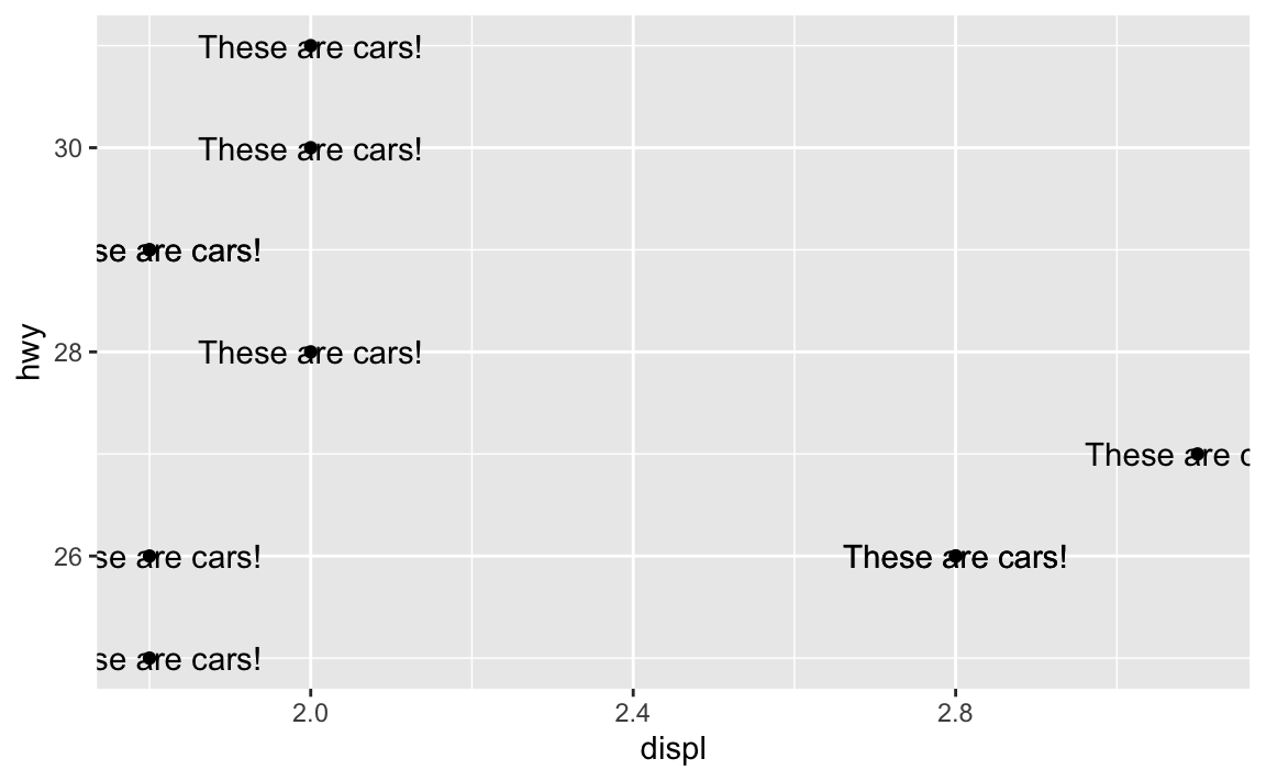
Where this trips people up is when you want to add annotations. You might say “Hey! I want to add an label that says ‘These are cars!’”, so you do this:
ggplot(mpg_small, aes(x = displ, y = hwy)) +geom_point() +geom_text(label ="These are cars!")
Oops. That’s no what you want! You’re getting the “These are cars!” annotation, but it’s showing up at every single point. That’s because you’re using geom_text()—it adds text for every row in the dataset.
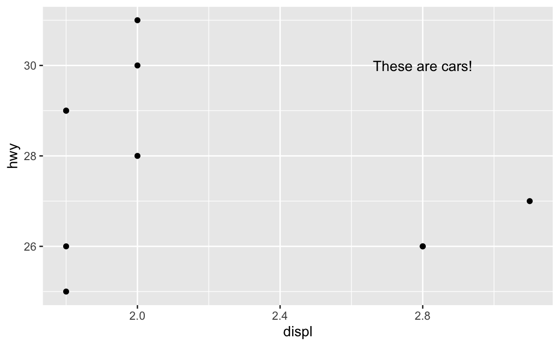
In this case, you want to use annotate() instead. Again, as you learned in the lesson, annotate() lets you add one single geom to the plot without needing any data mapped to it. You supply the data yourself.
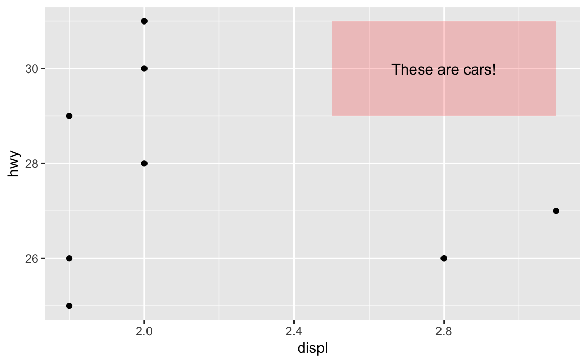
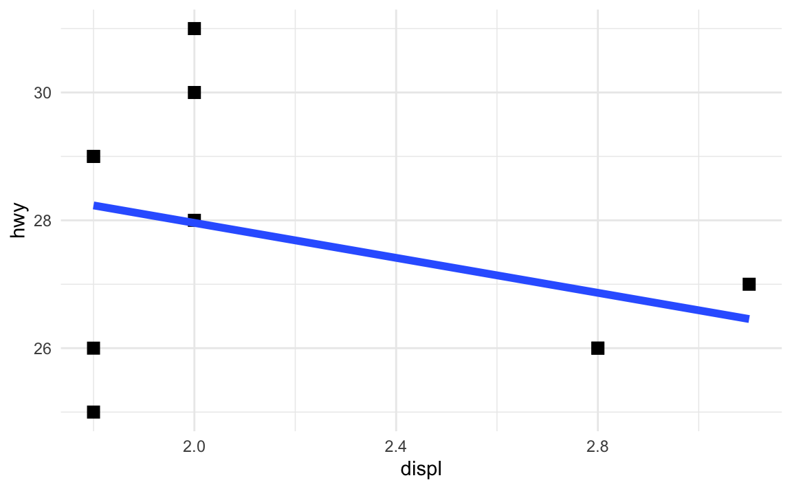
For example, there’s an empty space in this plot in the upper right corner. Let’s put a label at displ = 2.8 and hwy = 30, since there’s no data there:
ggplot(mpg_small, aes(x = displ, y = hwy)) +geom_point() +annotate(geom ="text", x =2.8, y =30, label ="These are cars!")
Now there’s just one label at the exact location we told it to use.
How do I know which aesthetics geoms need to use?
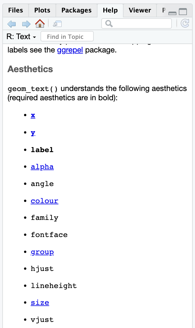
With annotate(), you have to specify all your own aesthetics manually, like x and y and label in the example above.How did we know that the text geom needed those?
The help page for every geom has a list of possible and required aesthetics. Aesthetics that are in bold are required. Here’s the list for geom_text()—it needs an x, y, and label, and it can do a ton of other things like color, alpha, size, fontface, and so on:
Help page for geom_text
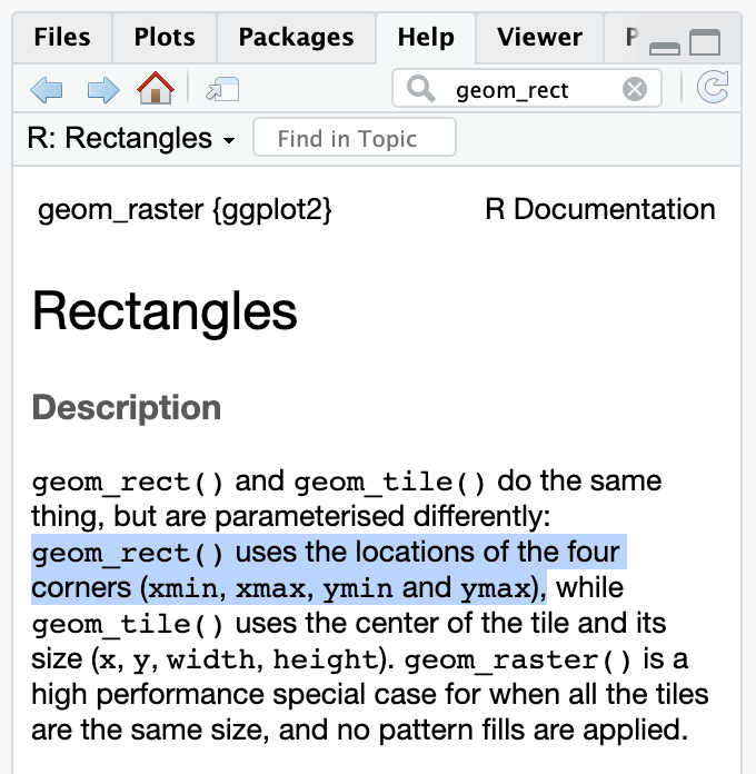
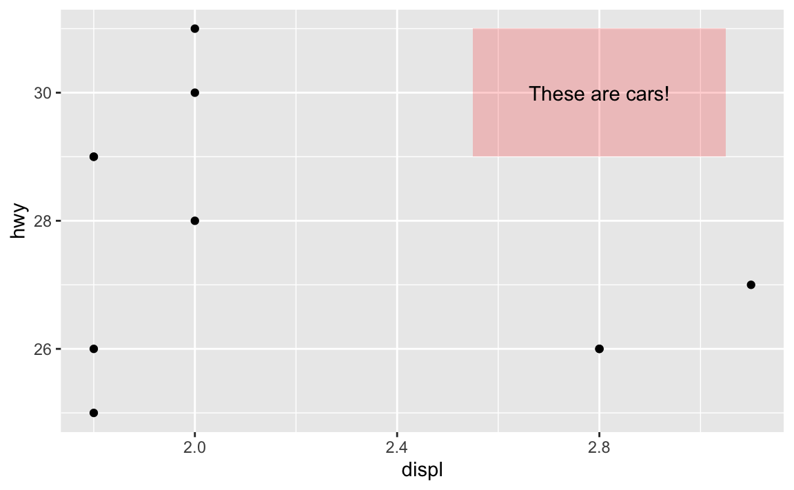
If you want to stick a rectangle on a plot with annotate(geom = "rect"), you need to look at the help page for geom_rect() to see how it works and which aesthetics it needs.
Help page for geom_rect
geom_rect() needs xmin, xmax, ymin, and ymax, and it can also do alpha, color (for the border), fill (for the fill), linewidth, and some other things:
ggplot(mpg_small, aes(x = displ, y = hwy)) +geom_point() +annotate(geom ="rect", xmin =2.5, xmax =3.1, ymin =29, ymax =31, fill ="red", alpha =0.2 ) +annotate(geom ="text", x =2.8, y =30, label ="These are cars!")
In that same help page, it mentions that geom_tile() is an alternative to geom_rect(), where you define the center of the rectangle with x and y and define the width and the height around that center. This is helpful for getting rectangles centered around certain points. I just eyeballed the 2.5, 3.1, 29, and 31 up there ↑ to get the rectangle centered behind the text. I can get it precise with geom_tile() instead:
ggplot(mpg_small, aes(x = displ, y = hwy)) +geom_point() +annotate(geom ="tile", x =2.8, y =30, width =0.5, height =2, fill ="red", alpha =0.2 ) +annotate(geom ="text", x =2.8, y =30, label ="These are cars!")
So always check the “Aesthetics” section of a geom’s help page to see what you can do with it!
It’s annoying to have to specify annotation positions using the values of the x/y axis scales. Is there a way to say “Put this in the middle of the graph” instead?
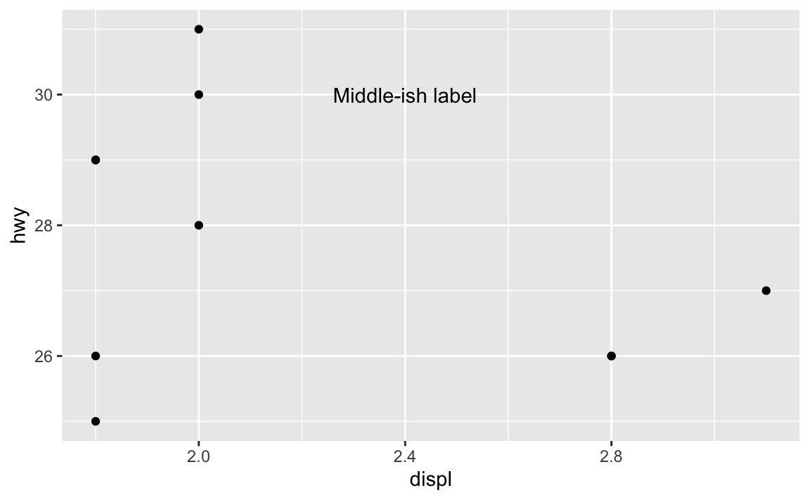
Yeah, this is super annoying. Like, what if you want a label to be horizontally centered in the plot, and have it near the top, maybe like 80% of the way to the top? Here’s how to eyeball it:
ggplot(mpg_small, aes(x = displ, y = hwy)) +geom_point() +annotate(geom ="text", x =2.4, y =30, label ="Middle-ish label")
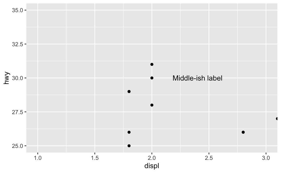
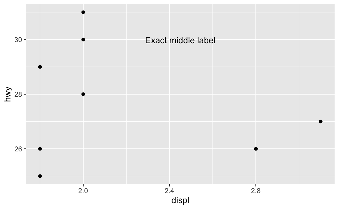
But that’s not actually centered—the x would need to be something like 2.46 or something ridiculous. And this isn’t very flexible. If new points get added or the boundareies of the axes change, that label will most definitely not be in the middle:
ggplot(mpg_small, aes(x = displ, y = hwy)) +geom_point() +annotate(geom ="text", x =2.4, y =30, label ="Middle-ish label") +coord_cartesian(xlim =c(1, 3), ylim =c(25, 35))
Fortunately there’s a way to ignore the values in the x and y axes and instead use relative positioning (see this for more). If you use a special I() function, you can define positions by percentages, so that x = I(0.5) will put the annotation at the 50% position in the plot, or right in the middel. y = I(0.8) will put the annotation 80% of the way up the y-axis:
ggplot(mpg_small, aes(x = displ, y = hwy)) +geom_point() +annotate(geom ="text", x =I(0.5), y =I(0.8), label ="Exact middle label")
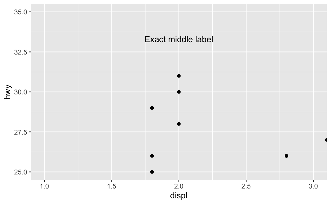
Now that’s exactly centered and 80% up, and will be regardless of how it’s zoomed. If we adjust the axes, it’ll still be there:
ggplot(mpg_small, aes(x = displ, y = hwy)) +geom_point() +annotate(geom ="text", x =I(0.5), y =I(0.8), label ="Exact middle label") +coord_cartesian(xlim =c(1, 3), ylim =c(25, 35))
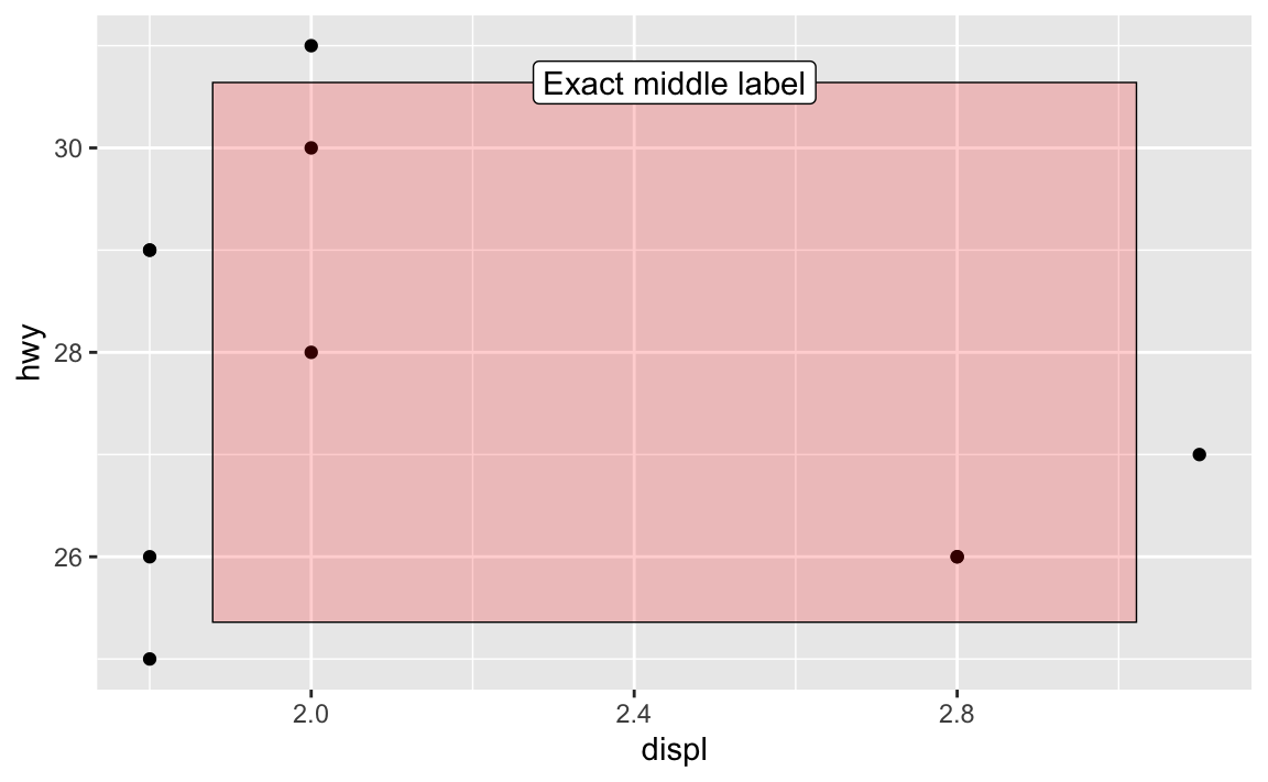
Want a rectangle to go all around the plot with corners at 10% and 90%, with a label that’s centered and positioned at 90% so it looks like it’s connected to the rectangle? Easy!
ggplot(mpg_small, aes(x = displ, y = hwy)) +geom_point() +annotate(geom ="rect", xmin =I(0.1), xmax =I(0.9), ymin =I(0.1), ymax =I(0.9),color ="black", linewidth =0.25, fill ="red", alpha =0.2 ) +annotate(geom ="label", x =I(0.5), y =I(0.9), label ="Exact middle label")
What’s the difference between geom_text() and geom_label()?
They’re the same, except geom_label() adds a border and background to the text. See this from the help page for geom_label():
geom_text() adds only text to the plot. geom_label() draws a rectangle behind the text, making it easier to read.
Which is better to use? That’s entirely context-dependent—there are no right answers.
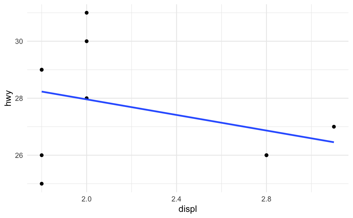
# Make all plots use theme_minimal()theme_set(theme_minimal())# This now uses theme_bw without needing to specify itggplot(mpg_small, aes(x = displ, y = hwy)) +geom_point() +geom_smooth(method ="lm", se =FALSE)
Let’s say I want those points to be a little bigger and be squares, and I want the fitted line to be thicker. I can change those settings in the different geom layers:
ggplot(mpg_small, aes(x = displ, y = hwy)) +geom_point(size =3, shape ="square") +geom_smooth(method ="lm", se =FALSE, linewidth =2)
What if I want all the points and lines in the document to be like that: big squares and thick lines? I’d need to remember to add those settings every time I use geom_point() or geom_smooth().
Or, even better, I can change all the default geom settings once:
Now every instance of geom_point() and geom_smooth() will use those settings:
ggplot(mpg_small, aes(x = displ, y = hwy)) +geom_point() +geom_smooth(method ="lm", se =FALSE)
In the example for session 9, I used update_geom_defaults() to change the font for all the text and label geoms. Without that, I’d need to include family = "IBM Plex Sans" in every single layer that used text or labels.
How do annotations work with facets?
Oh man, this is a tricky one!
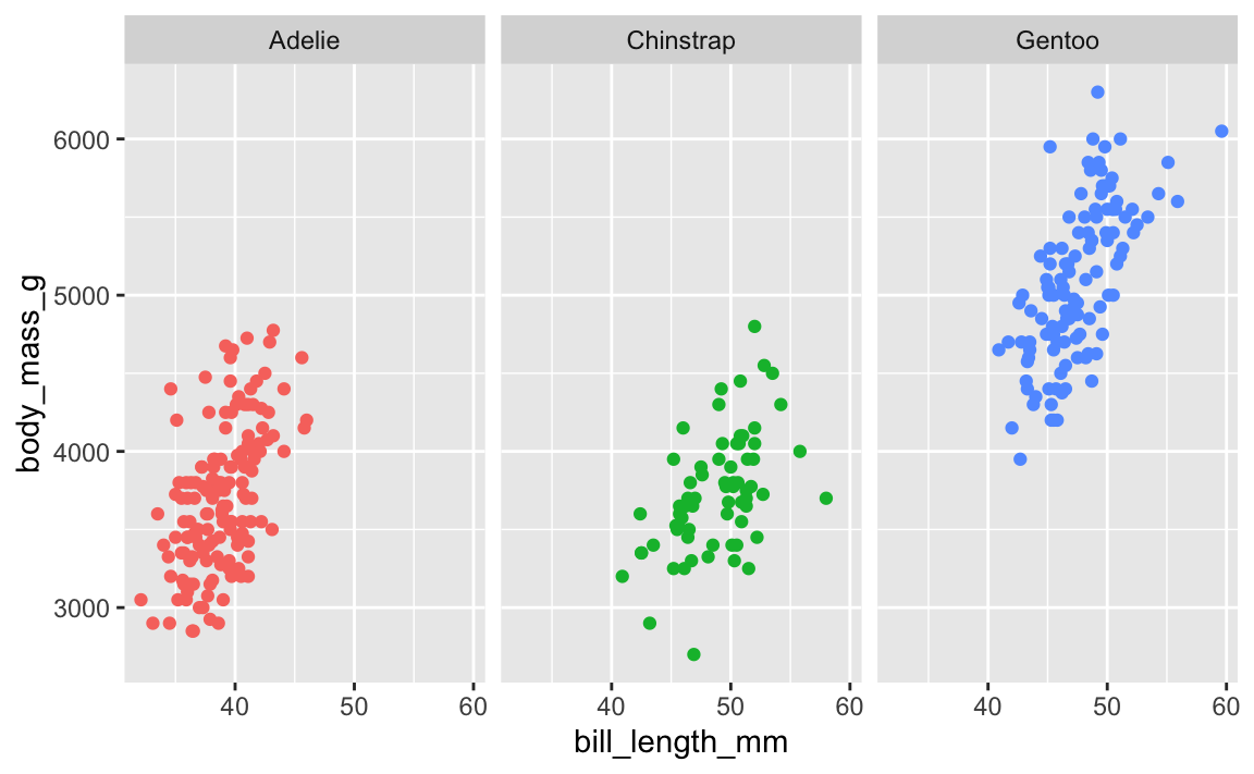
Here’s a little plot of penguin stuff faceted by penguin species:
library(palmerpenguins)penguins <- palmerpenguins::penguins |>drop_na(sex)ggplot(penguins, aes(x = bill_length_mm, y = body_mass_g, color = species)) +geom_point() +guides(color ="none") +# No need for a legend since we have facetsfacet_wrap(vars(species))
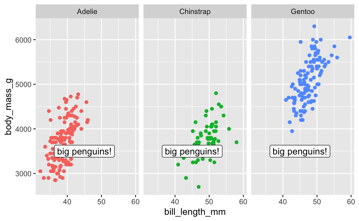
Cool. Now let’s add a label pointing out that Gentoos are bigger than the others:
ggplot(penguins, aes(x = bill_length_mm, y = body_mass_g, color = species)) +geom_point() +guides(color ="none") +# No need for a legend since we have facetsfacet_wrap(vars(species)) +annotate(geom ="label", x =45, y =3500, label ="big penguins!")
Oops. That label appears in every facet! There is no built-in way to specify that that annotate() should only appear in one of the facets.
There are two solutions: one is super easy and one is more complex but very flexible.
First, the easy one. There’s a package named {ggh4x} that has a bunch of really neat ggplot enhancements (like, check out nested facets! I love these and use them all the time). One function it includes is at_panel(), which lets you constrain annotate() layers to specific panels
library(ggh4x)ggplot(penguins, aes(x = bill_length_mm, y = body_mass_g, color = species)) +geom_point() +guides(color ="none") +# No need for a legend since we have facetsfacet_wrap(vars(species)) +at_panel(annotate(geom ="label", x =45, y =3500, label ="big penguins!"), species =="Gentoo" )
Next, the more complex one. With this approach, we don’t use annotate() and use geom_label() instead. I KNOW THIS FEELS WRONG—there was a whole question above about the difference between the two and I said that geom_text() is for labeling all the points in the dataset while annotate() is for adding one label.
So the trick here is that we make a tiny little dataset with the annotation details we want:
# Make a tiny datasetsuper_tiny_label_data <-tibble(x =45, y =3500, species ="Gentoo", label ="big penguins!")super_tiny_label_data## # A tibble: 1 × 4## x y species label ## <dbl> <dbl> <chr> <chr> ## 1 45 3500 Gentoo big penguins!
We can then plot it with geom_label(), which lets us limit the point to just the Gentoo panel:
ggplot(penguins, aes(x = bill_length_mm, y = body_mass_g, color = species)) +geom_point() +geom_label(data = super_tiny_label_data,aes(x = x, y = y, label = label),inherit.aes =FALSE# Ignore all the other global aesthetics, like color ) +guides(color ="none") +facet_wrap(vars(species))
The importance of layer order
So far this semester, most of your plots have involved one or two geom_* layers. At one point in some video (I think), I mentioned that layer order doesn’t matter with ggplot. These two chunks of code create identical plots:
All those functions can happen in whatever order you want, with one exception. The order of the geom layers matters. The first geom layer you specify will be plotted first, the second will go on top of it, and so on.
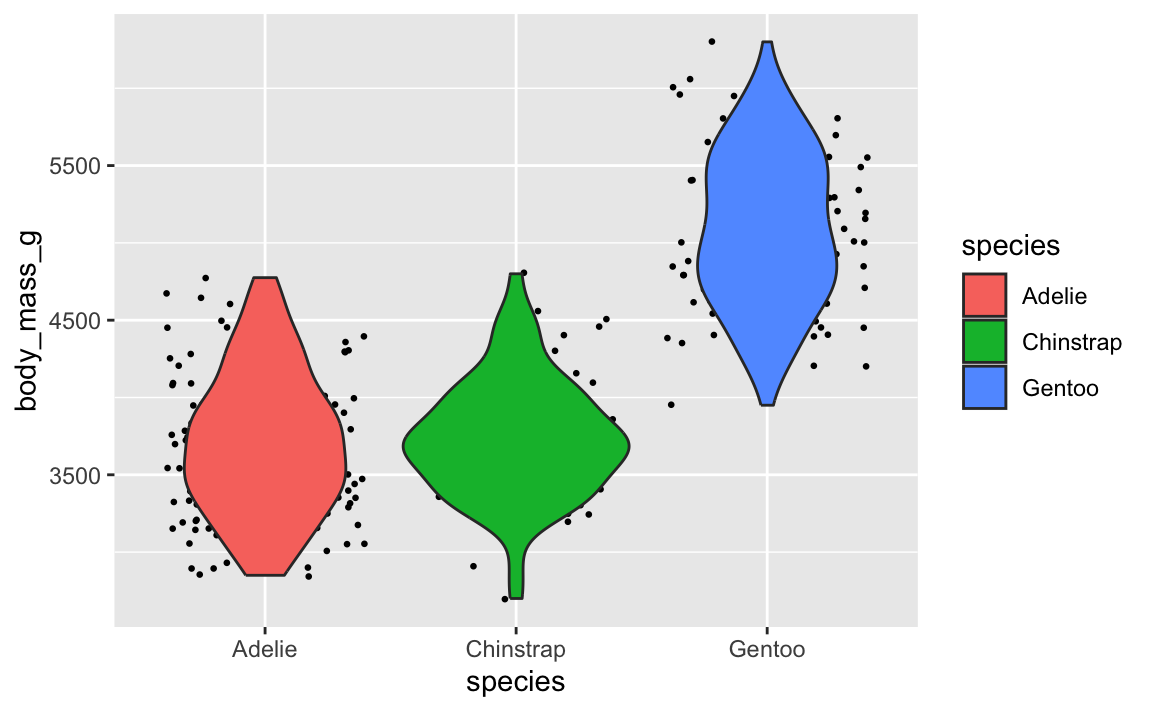
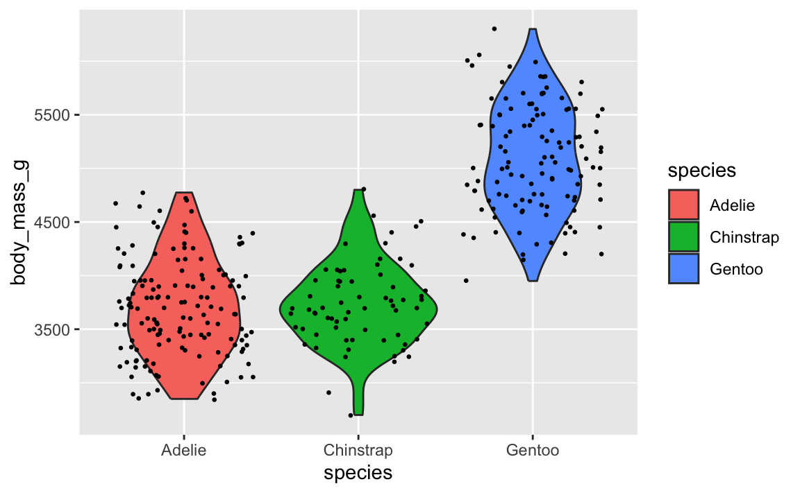
Let’s say you want to have a violin plot with jittered points on top. If you put geom_point() first, the points will be hidden by the violins:
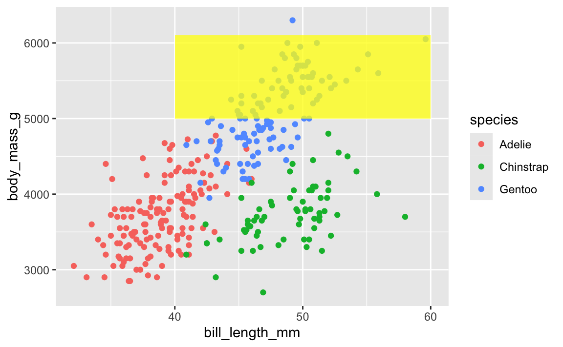
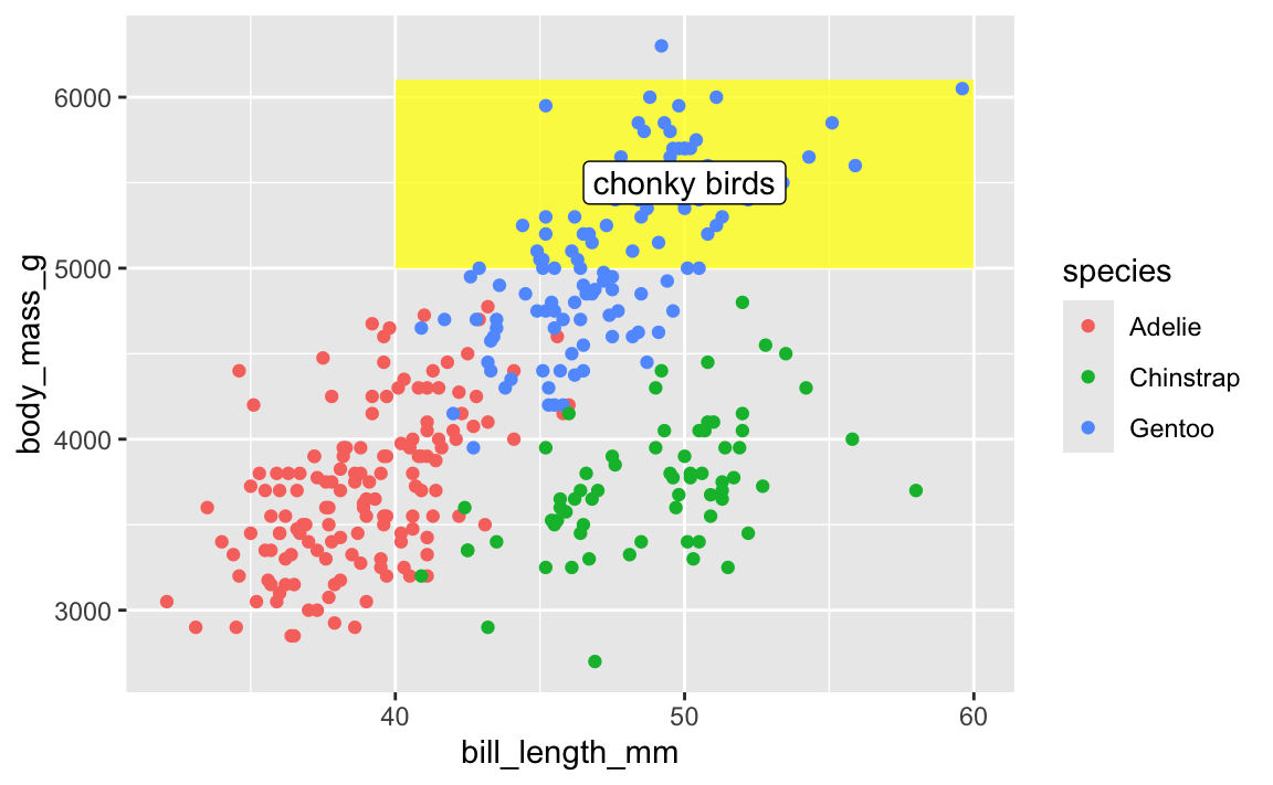
This layer order applies to annotation layers too. If you want to highlight an area of the plot, adding a rectangle after the geom layers will cover things up, like this ugly yellow rectangle here:
This doesn’t mean allannotate() layers should come first—if you want an extra label on top of a geom, make sure it comes after:
ggplot(penguins, aes(x = bill_length_mm, y = body_mass_g, color = species)) +# Yellow rectangle behind everythingannotate(geom ="rect", xmin =40, xmax =60, ymin =5000, ymax =6100,fill ="yellow", alpha =0.75) +# Pointsgeom_point() +# Label on top of the points and the rectangleannotate(geom ="label", x =50, y =5500, label ="chonky birds")
TipMy personal preferred general layer order
When I make my plots, I try to keep my layers in logical groups. I’ll do my geoms and annotations first, then scale adjustments, then guide adjustments, then labels, then facets (if any), and end with theme adjustments, like this:
This is totally arbitrary though! All that really matters is that the geoms and annotations are in the right order and that any theme adjustments you make with theme() come after a more general theme like theme_grey() or theme_minimal(), etc.. I’d recommend you figure out your own preferred style and try to stay consistent—it’ll make your life easier and more predictable.
Seeds—why?
There were a couple common questions about seeds:
1. Why do we even need seeds?
As discussed in the lecture, seeds make random things reproducible. They let you make random things again.
NoteMinecraft
If you’ve ever played Minecraft, seeds are pretty important there too. Minecraft worlds (all the mountains, oceans, biomes, mines, etc.) are completely randomly generated. When you create a new world, it gives an option to specify a seed. If you don’t, the world will just be random. If you do, the world will still be random, but it’ll be the same random. There are actually Reddit forums where people play around with different seeds to find interesting random worlds—like weirdly shaped landmasses, interesting starting places, and so on. Some gamers will stream their games on YouTube or Twitch and will share their world’s seed so that others can play in the same auto-generated world. That doesn’t mean that others play with them—it means that others will have mountains and trees and oceans and mines and resources in exactly the same spot as them, since it’s the same randomly auto-generated world.
When R (or any computer program, really) generates random numbers, it uses an algorithm to simulate randomness. This algorithm always starts with an initial number, or seed. Typically it will use something like the current number of milliseconds since some date, so that every time you generate random numbers they’ll be different. Look at this, for instance:
# Choose 3 numbers between 1 and 10sample(1:10, 3)## [1] 9 4 7
# Choose 3 numbers between 1 and 10sample(1:10, 3)## [1] 5 6 9
They’re different both times.
That’s ordinarily totally fine, but if you care about reproducibility (like having a synthetic dataset with the same random values, or having jittered points in a plot be in the same position every time you render), it’s a good idea to set your own seed. This ensures that the random numbers you generate are the same every time you generate them.
If you set a seed, you control how the random algorithm starts. You’ll still generate random numbers, but they’ll be the same randomness every time, on anyone’s computer. Run this on your computer:
set.seed(1234)sample(1:10, 3)## [1] 10 6 5
You’ll get 10, 6, and 5, just like I did here. They’re random, but they’re reproducibly random.
In data visualization, this is especially important for anything with randomness, like jittering points or repelling labels.
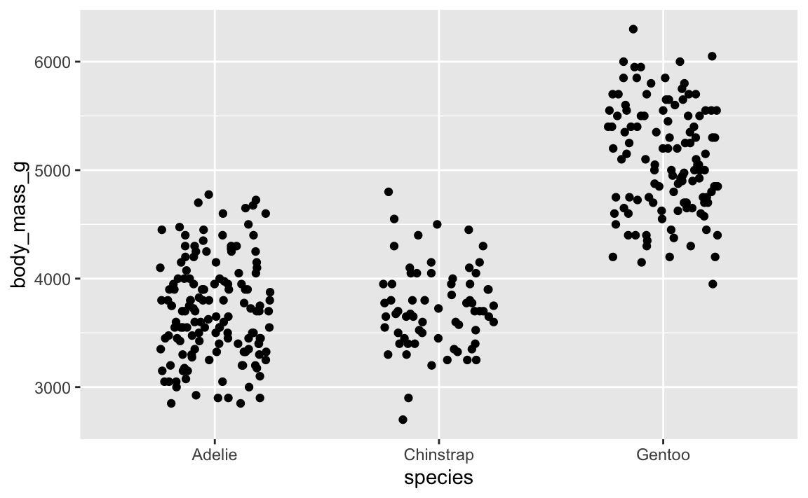
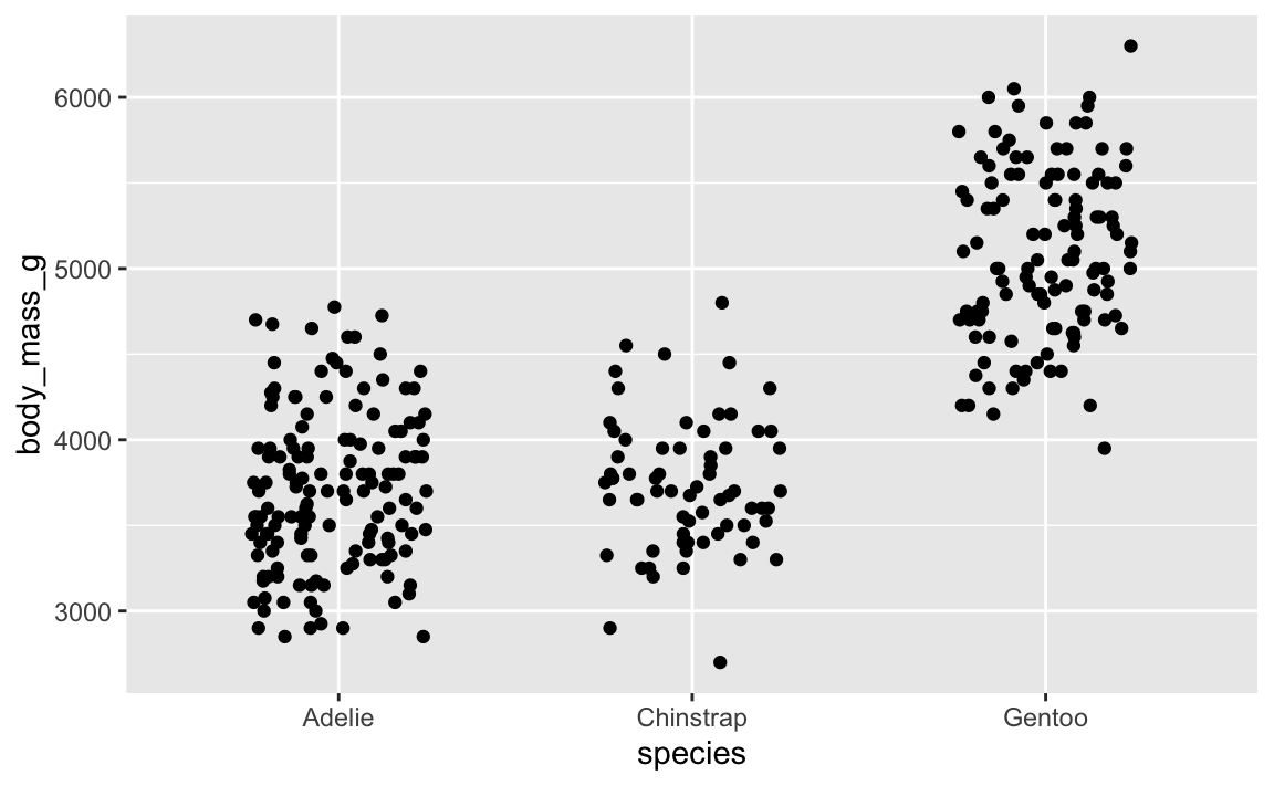
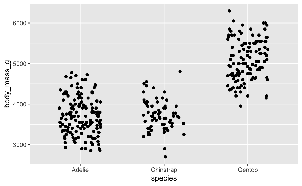
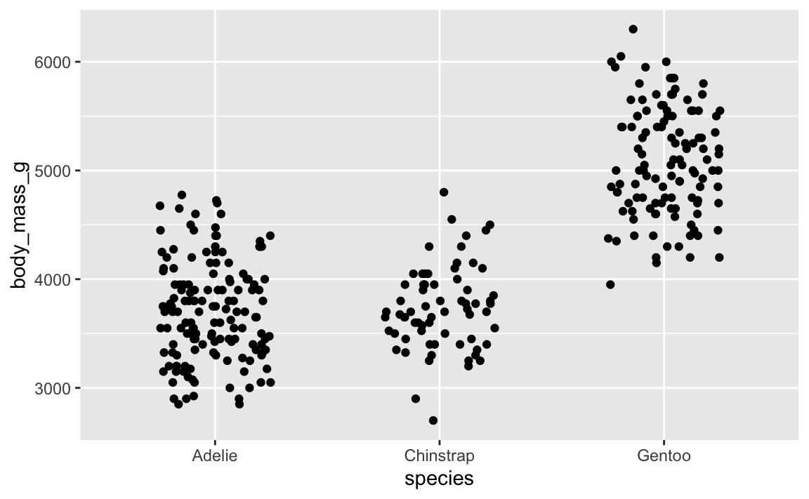
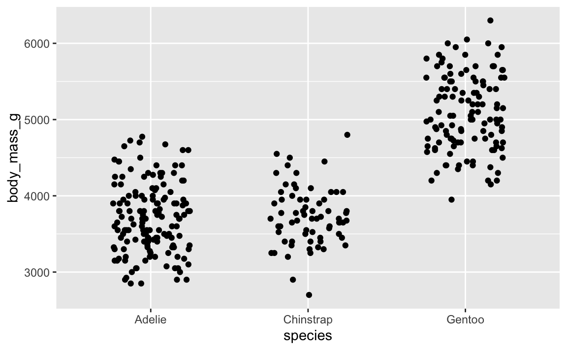
For instance, if we make this jittered strip plot of penguin data:
penguins <- palmerpenguins::penguins |>drop_na(sex)ggplot(penguins, aes(x = species, y = body_mass_g)) +# height = 0 makes it so points don't jitter up and downgeom_point(position =position_jitter(width =0.25, height =0))
…it’s different again! It’s going to be different every time, which is annoying.
Slight variations in jittered points is a minor annoyance—a major annoyance is when you tinker with settings in geom_label_repel() to make sure everything is nice and not overlapping, and then when you render the plot again, everything is in a completely different spot. This happens because the repelling is random, just like jittering. You want the randomness, but you want the randomness to be the same every time.
To ensure that the randomness is the same each time, you can set a seed. position_jitter() and geom_label_repel() both have seed arguments that you can use. Here’s a randomly jittered plot:
You can also use set.seed() separately outside of the function, which sets the seed for all random things in the document (though note that this doesn’t create the same plot that position_jitter(seed = 1234) does! There are technical reasons for this, but you don’t need to worry about that.)
24601 (Jean Valjean’s inmate number in Les Misérables)
Practical ones:
The date of the analysis, like 20250715 for something written on July 15, 2025
A truly random integer based on atmospheric noise from RANDOM.ORG
In practice, especially for plots and making sure jittered and repelled things look good and consistent, it doesn’t really matter what you use.
Here’s what I typically do:
For plotting things, I’ll generally just use 1234. If I’m not happy with the shuffling (like two labels are too close, or one point is jittered too far up or something), I’ll change it to 12345 or 123456 or 123 until it looks okay.
For analysis, I’ll generate some 6- or 7-digit integer at RANDOM.ORG and use that as the seed (I do this all the time! Check out this search of my GitHub repositories). This is especially important in things like Bayesian regression, which uses random simulations to calculate derivatives and do all sorts of mathy things. Seeds are crucial there for getting the same results every time.