library(tidyverse)

penguins <- penguins |>
  drop_na(sex)

ggplot(penguins, aes(x = body_mass, fill = species)) +
  geom_density(alpha = 0.5)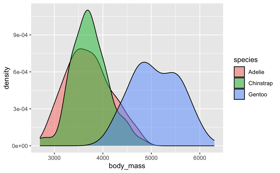
Ha yeah, so despite what we covered back in the week on uncertainty, violin plots aren’t actually that great and there are better alternatives.
If you want a detailed deep dive into why they’re bad, check out this (long but fascinating!) video rant that covers both (1) the visual and interpretive issues with them, and (2) the sexism/misogyny that can inadvertently arise from using them:
Density plots are fine and great and wonderful and I use them all the time. They’re great for visualizing the distribution of variables. Like here, Gentoos are generally heavier than the other two species of penguins, and Adelies and Chinstraps are basically around the same weight:
library(tidyverse)
penguins <- penguins |>
drop_na(sex)
ggplot(penguins, aes(x = body_mass, fill = species)) +
geom_density(alpha = 0.5)
And you can do fancier things with them, like overlaying lots of them with {ggridges} (like you did in Exercise 6) or adding extra details like points (like with {gghalves}).
library(gghalves)
library(ggridges)

set.seed(1234)

ggplot(penguins, aes(x = body_mass, y = species, fill = species)) +
  geom_density_ridges() +
  guides(fill = "none")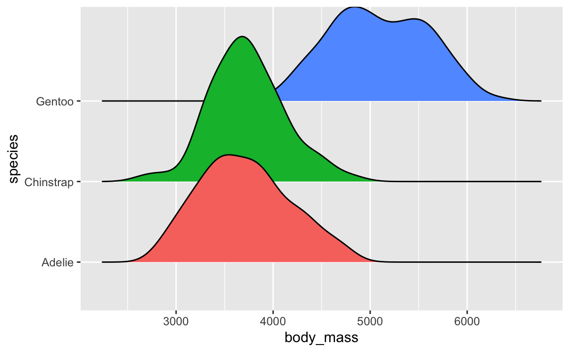
ggplot(penguins, aes(x = species, y = body_mass, fill = species)) +
  geom_half_point(aes(color = species), side = "l", size = 0.25) +
  geom_half_violin(side = "r") +
  guides(color = "none", fill = "none") +
  coord_flip()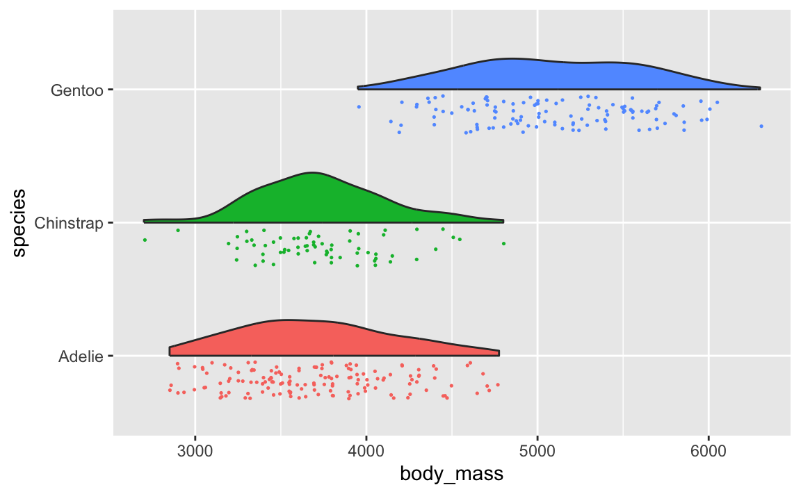
You can even use the {ggdist} package to make all sorts of fancier density plots with extra information like point ranges showing the mean and confidence interval:
library(ggdist)

ggplot(penguins, aes(x = body_mass, y = species, fill = species)) +
  geom_dots(layout = "weave", side = "bottom") +
  stat_slabinterval() +
  guides(color = "none", fill = "none")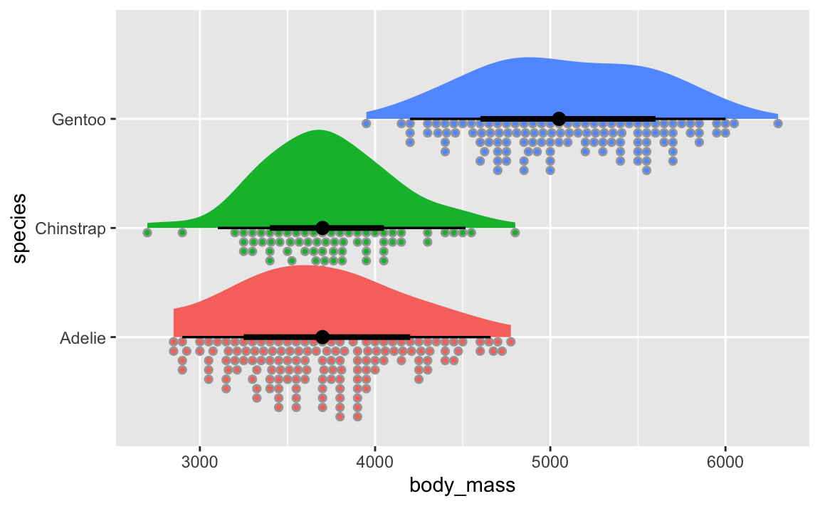
Violin plots are weird because they’re normal density plots, but duplicated and flipped so that they make big blobs.
ggplot(penguins, aes(x = species, y = body_mass, fill = species)) +
  geom_violin() +
  guides(fill = "none")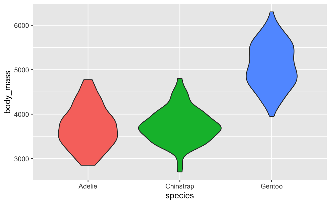
↑ those are just doubled density plots! Like, if we draw a line through each of the blobs, and rotate the plot, you can see the regular density plot and its mirrored version:
ggplot(penguins, aes(x = species, y = body_mass, fill = species)) +
  geom_violin() +
  geom_vline(xintercept = 1:3) +
  guides(fill = "none") +
  coord_flip()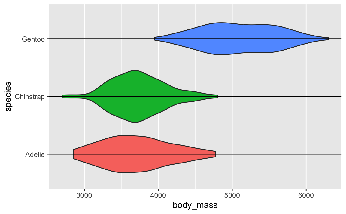
In that video up above, Angela Collier argues that the blobbiness of these violin plots is (1) useless and (2) adds no additional information and (3) bad.
So in practice, yes, geom_violin() is a thing, but I’d recommend not using it. Stick with regular density plots or their fancier versions from {ggdist} and {ggridges} and {gghalves} (geom_half_violin() from {gghalves} itself is bizarre because a half violin plot is just a regular density plot!).
paste0() to build complex text is annoying! Is there a better way?In the example, I use paste0() to build text. The paste() function takes text and variables and concatenates them together into one string or character variable.
For instance, if I want to take the penguins data and make a column that says something like Species (sex; weight: X g; flipper length: Y mm), I’d do this:
penguins |>
  mutate(nice_label = paste0(
    species, " (", sex, "; weight: ", body_mass,
    " g; flipper length: ", flipper_len, " mm)"
  )) |>
  select(nice_label) |>
  head(4)
##                                                nice_label
## 1   Adelie (male; weight: 3750 g; flipper length: 181 mm)
## 2 Adelie (female; weight: 3800 g; flipper length: 186 mm)
## 3 Adelie (female; weight: 3250 g; flipper length: 195 mm)
## 4 Adelie (female; weight: 3450 g; flipper length: 193 mm)
That works, but that mix of variable names and quoted things inside paste0() is horrendously gross and hard to read and annoying to type!
Fortunately there’s a better way! The {glue} package (which is installed as part of the tidyverse, but not loaded with library(tidyverse)) lets you substitute variable values directly in text without needing to separate everything with commas. Anything inside curly braces {} will get replaced with the value in the data:
library(glue)

penguins |>
  mutate(nice_label = glue(
    "{species} ({sex}; weight: {body_mass} g; flipper length: {flipper_len} mm)"
  )) |>
  select(nice_label) |>
  head(4)
##                                                nice_label
## 1   Adelie (male; weight: 3750 g; flipper length: 181 mm)
## 2 Adelie (female; weight: 3800 g; flipper length: 186 mm)
## 3 Adelie (female; weight: 3250 g; flipper length: 195 mm)
## 4 Adelie (female; weight: 3450 g; flipper length: 193 mm)
Much nicer!
When making your slopegraph, lots of you used two geom_text() (or geom_text_repel()) layers with different hjust arguments to make the labels left- and right-aligned, but you ended up with this:
library(gapminder)
library(ggrepel)

example_slope_graph <- gapminder |>
  filter(year %in% c(1977, 2007), continent != "Oceania") |>
  group_by(year, continent) |>
  summarize(avg_lifeExp = mean(lifeExp))

ggplot(
  example_slope_graph,
  aes(x = factor(year), y = avg_lifeExp, color = continent, group = continent)
) +
  geom_line() +
  geom_text(aes(label = continent), hjust = 0) +
  geom_text(aes(label = continent), hjust = 1) +
  guides(color = "none") +
  labs(x = NULL, y = "Average life expectancy") +
  theme_minimal()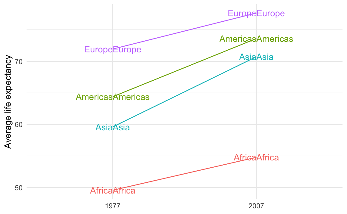
That’s because you’re plotting the values twice. You should plot them twice, but you need to control which ones you’re plotting. You want the labels for the left side of the plot (1977 here) to be right-aligned and the labels for the right side of the plot (2007 here) to be left-aligned.
To do that, you can filter the data that you’re plotting with each of the geom_text() layers:
ggplot(
  example_slope_graph,
  aes(x = factor(year), y = avg_lifeExp, color = continent, group = continent)
) +
  geom_line() +
  geom_text(
    data = filter(example_slope_graph, year == 2007),
    aes(label = continent),
    hjust = 0
  ) +
  geom_text(
    data = filter(example_slope_graph, year == 1977),
    aes(label = continent),
    hjust = 1
  ) +
  guides(color = "none") +
  labs(x = NULL, y = "Average life expectancy") +
  theme_minimal()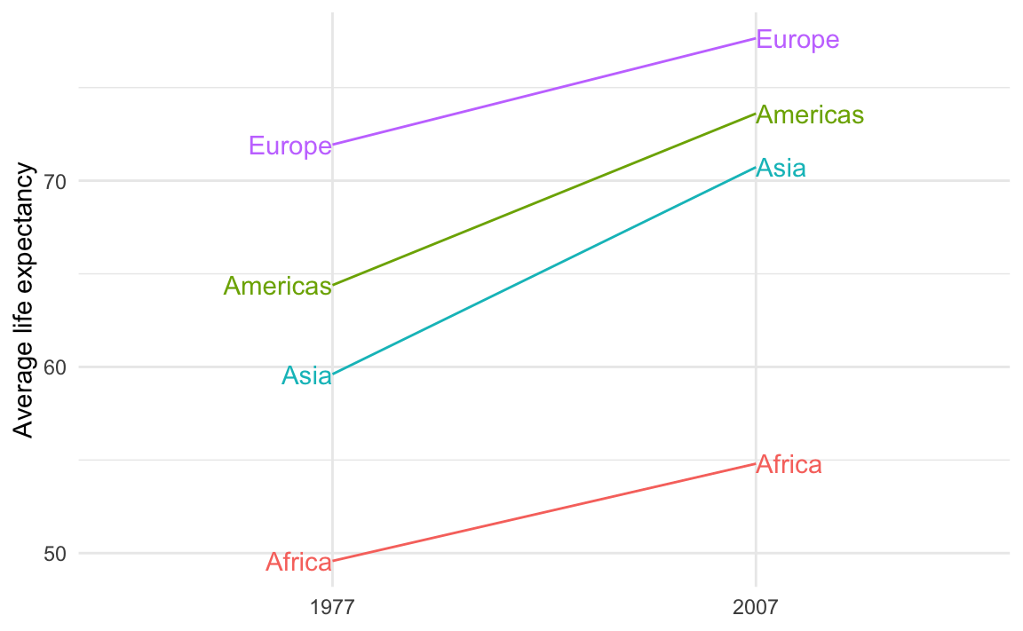
Alternatively, you can avoid filtering and instead make two different columns—one with labels for the first/left side and one with labels for the last/right side. This is what I do in the example. This is especially useful if you’re customizing the labels so that the first is formatted differently from the last.
For instance, we can use the continent name and life expectancy for the first label and just the life expectancy for the last label, since there’s no need to repeat the continent name. We’ll use glue() from the {glue} package to make two label columns. The first version is only present in 1977; the second version is only present in 2007:
library(glue)

example_slope_graph_nice_labels <- gapminder |>
  filter(year %in% c(1977, 2007), continent != "Oceania") |>
  group_by(year, continent) |>
  summarize(avg_lifeExp = mean(lifeExp)) |>
  mutate(
    label_first = ifelse(
      year == 1977,
      glue("{continent}:\n{round(avg_lifeExp, 2)} years"),
      NA
    ),
    label_last = ifelse(
      year == 2007,
      glue("{round(avg_lifeExp, 2)} years"),
      NA
    )
  )
example_slope_graph_nice_labels
## # A tibble: 8 × 5
## # Groups:   year [2]
##    year continent avg_lifeExp label_first              label_last
##   <int> <fct>           <dbl> <chr>                    <chr>
## 1  1977 Africa           49.6 "Africa:\n49.58 years"   <NA>
## 2  1977 Americas         64.4 "Americas:\n64.39 years" <NA>
## 3  1977 Asia             59.6 "Asia:\n59.61 years"     <NA>
## 4  1977 Europe           71.9 "Europe:\n71.94 years"   <NA>
## 5  2007 Africa           54.8  <NA>                    54.81 years
## 6  2007 Americas         73.6  <NA>                    73.61 years
## 7  2007 Asia             70.7  <NA>                    70.73 years
## 8  2007 Europe           77.6  <NA>                    77.65 years
Now we can use those two label columns and we don’t need to filter anymore:
ggplot(
  example_slope_graph_nice_labels,
  aes(x = factor(year), y = avg_lifeExp, color = continent, group = continent)
) +
  geom_line() +
  geom_text(aes(label = label_first), hjust = 1) +
  geom_text(aes(label = label_last), hjust = 0) +
  guides(color = "none") +
  labs(x = NULL, y = "Average life expectancy") +
  theme_minimal()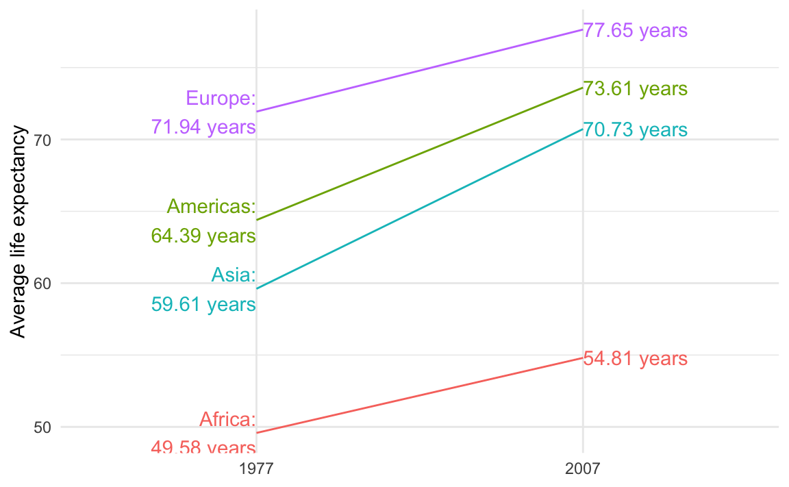
If you’re using {ggrepel} the repelled labels will have little guide lines to indicate the points they’re supposed to represent:
ggplot(
  example_slope_graph,
  aes(x = factor(year), y = avg_lifeExp, color = continent, group = continent)
) +
  geom_line() +
  geom_text_repel(
    data = filter(example_slope_graph, year == 2007),
    aes(label = continent),
    hjust = 0,
    direction = "y",
    nudge_x = 0.5,
    seed = 1234
  ) +
  geom_text_repel(
    data = filter(example_slope_graph, year == 1977),
    aes(label = continent),
    hjust = 1,
    direction = "y",
    nudge_x = -0.5,
    seed = 1234,
  ) +
  guides(color = "none") +
  labs(x = NULL, y = "Average life expectancy") +
  theme_minimal()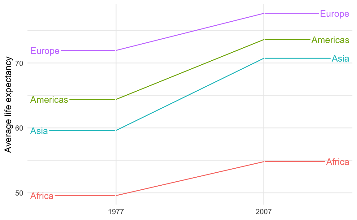
Those guide lines are helpful, but they look too much like actual data lines! It looks like life expectancy goes flat for the years before 1977 and after 2007.
This is breaking the C in CRAP—there’s not a lot of contrast between the data lines and the guide lines.
To fix it, make them different and add contrast. For instance, we can make the data lines thicker with linewidth and make the guide lines dotted with segment.linetype:
ggplot(
  example_slope_graph,
  aes(x = factor(year), y = avg_lifeExp, color = continent, group = continent)
) +
  geom_line(linewidth = 1.5) +
  geom_text_repel(
    data = filter(example_slope_graph, year == 2007),
    aes(label = continent),
    hjust = 0,
    direction = "y",
    nudge_x = 0.5,
    seed = 1234,
    segment.linetype = "dotted"
  ) +
  geom_text_repel(
    data = filter(example_slope_graph, year == 1977),
    aes(label = continent),
    hjust = 1,
    direction = "y",
    nudge_x = -0.5,
    seed = 1234,
    segment.linetype = "dotted"
  ) +
  guides(color = "none") +
  labs(x = NULL, y = "Average life expectancy") +
  theme_minimal()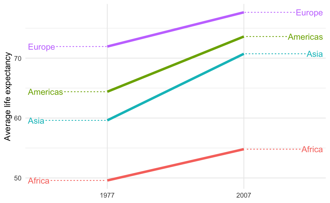
Yes you can! There’s an incredible package called {scales}. It lets you format numbers and axes and all sorts of things in magical ways. If you look at the documentation, you’ll see a ton of label_SOMETHING() functions, like label_comma(), label_dollar(), and label_percent().
You can use these different labeling functions inside scale_AESTHETIC_WHATEVER() layers in ggplot.
label_comma() adds commas:
library(tidyverse)
library(scales)
library(gapminder)

gapminder_2007 <- gapminder |>
  filter(year == 2007)

ggplot(gapminder_2007, aes(x = gdpPercap)) +
  geom_histogram(binwidth = 1000) +
  scale_x_continuous(labels = label_comma())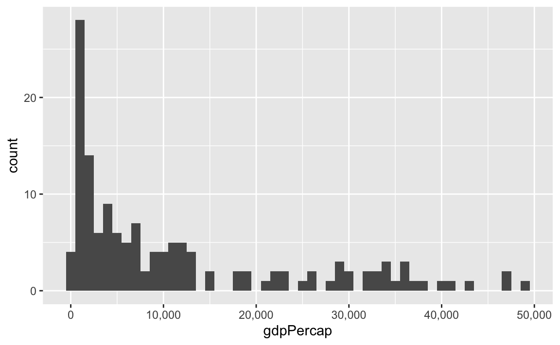
label_dollar() adds commas and includes a “$” prefix:
ggplot(gapminder_2007, aes(x = gdpPercap)) +
  geom_histogram(binwidth = 1000) +
  scale_x_continuous(labels = label_dollar())
label_percent() multiplies values by 100 and formats them as percents:
gapminder_percents <- gapminder_2007 |>
  group_by(continent) |>
  summarize(n = n()) |>
  mutate(prop = n / sum(n))

ggplot(gapminder_percents, aes(x = continent, y = prop)) +
  geom_col() +
  scale_y_continuous(labels = label_percent())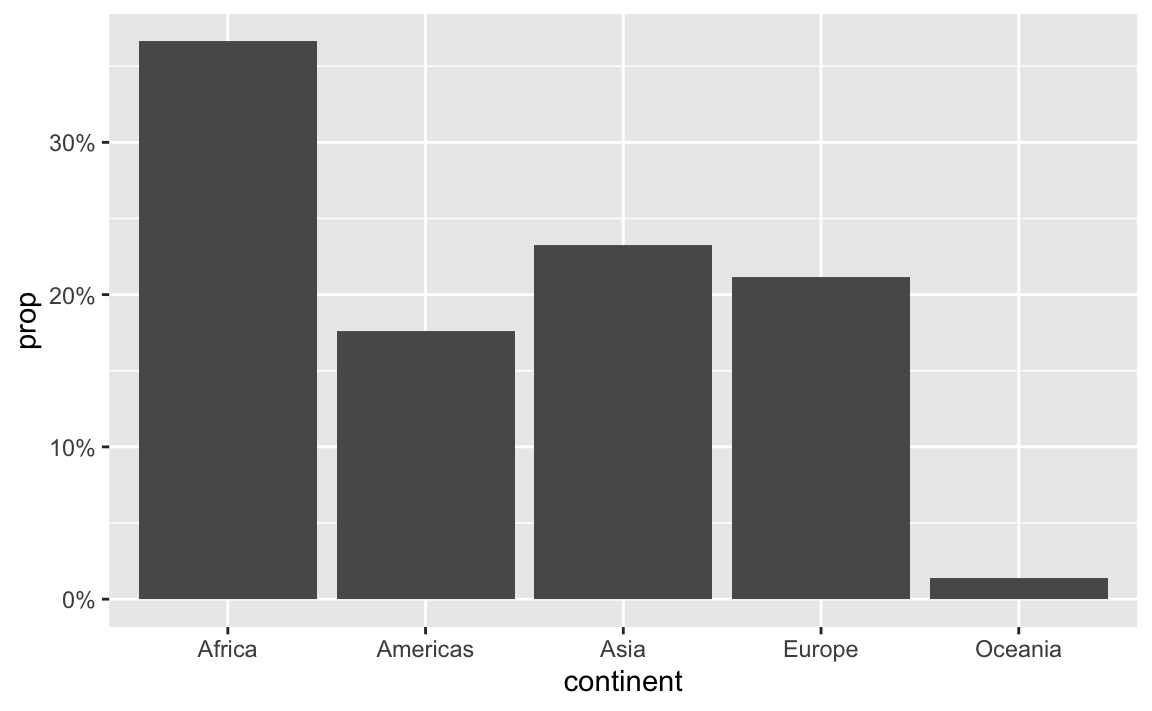
You can also change a ton of the settings for these different labeling functions. Want to format something as Euros and use periods as the number separators instead of commas, like Europeans? Change the appropriate arguments! You can check the documentation for each of the label_WHATEVER() functions to see what you can adjust (like label_dollar() here)
ggplot(gapminder_2007, aes(x = gdpPercap)) +
  geom_histogram(binwidth = 1000) +
  scale_x_continuous(labels = label_dollar(prefix = "€", big.mark = "."))
All the label_WHATEVER() functions actually create copies of themselves, so if you’re using lots of custom settings, you can create your own label function, like label_euro() here:
# Make a custom labeling function
label_euro <- label_dollar(prefix = "€", big.mark = ".")

# Use it on the x-axis
ggplot(gapminder_2007, aes(x = gdpPercap)) +
  geom_histogram(binwidth = 1000) +
  scale_x_continuous(labels = label_euro)
These labeling functions also work with other aesthetics, like fill and color and size. Use them in scale_AESTHETIC_WHATEVER():
ggplot(
  gapminder_2007,
  aes(x = gdpPercap, y = lifeExp, size = pop, color = pop)
) +
  geom_point() +
  scale_x_continuous(labels = label_dollar()) +
  scale_size_continuous(labels = label_comma()) +
  scale_color_viridis_c(labels = label_comma())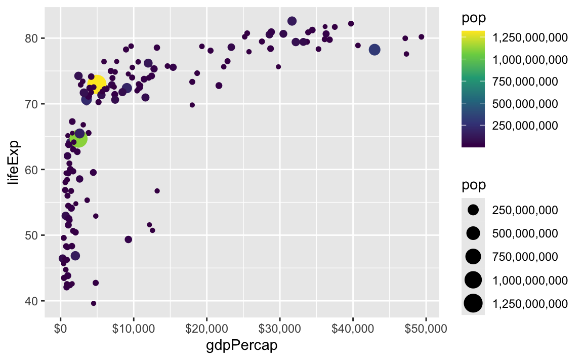
There are also some really neat and fancy things you can do with scales, like formatting logged values, abbreviating long numbers, and many other things. Check out this post for an example of working with logged values.
ggplot(
  gapminder_2007,
  aes(x = gdpPercap, y = lifeExp, size = pop, color = continent)
) +
  geom_point() +
  scale_x_log10(
    breaks = 500 * 2^seq(1, 9, by = 1),
    labels = label_dollar(scale_cut = append(scales::cut_short_scale(), 1, 1))
  ) +
  scale_size_continuous(labels = label_comma(scale_cut = cut_short_scale()))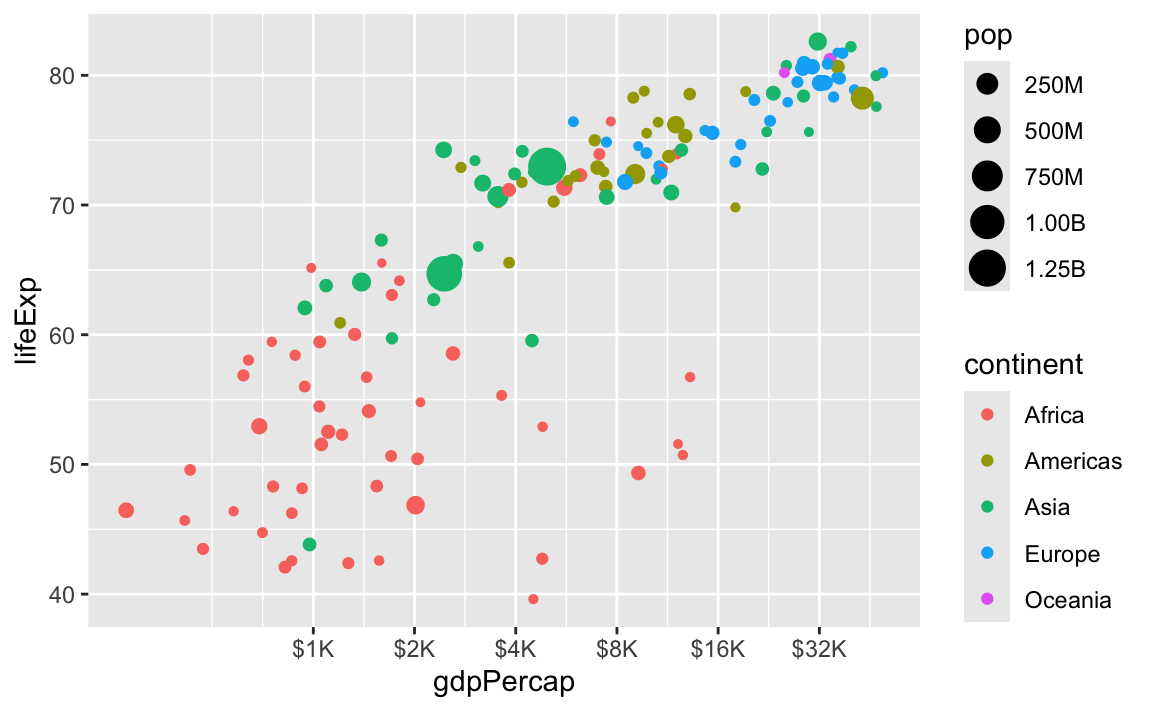
Yes! You’ll see them pop up all over the place. Check out this article by ProPublica, for example, which includes maps like this:

Many of you have asked how to take month numbers and change them into month names or month abbreviations.
I’ve seen some of you use something like a big if else statement: if the month number is 1, use “January”; if the month number is 2, use “February”; and so on
... |>
  mutate(month_name = case_when(
    month_number == 1 ~ "January",
    month_number == 2 ~ "February",
    month_number == 3 ~ "March",
    ...
  ))
While that works, it’s kind of a brute force approach. There’s a better, far easier way!
The {lubridate} package (one of the nine packages that gets loaded when you run library(tidyverse)) has some neat functions for extracting and formatting parts of dates. You saw these in Exercise 4:
# Add columns for the year and month
mutate(
  intake_year = year(intake_date),
  intake_month = month(intake_date, label = TRUE, abbr = FALSE)
)
These take dates and do stuff with them. For instance, let’s put today’s date in a variable named x:
x <- ymd("2025-10-21")
x
## [1] "2025-10-21"
We can extract the year using year():
year(x)
## [1] 2025
…or the week number using weeknum():
week(x)
## [1] 42
…or the month number using month():
month(x)
## [1] 10
If you look at the help page for month(), you’ll see that it has arguments for label and abbr, which will toggle text instead numbers, and full month names instead of abbreviations:
month(x, label = TRUE, abbr = TRUE)
## [1] Oct
## 12 Levels: Jan < Feb < Mar < Apr < May < Jun < Jul < Aug < Sep < ... < Dec
month(x, label = TRUE, abbr = FALSE)
## [1] October
## 12 Levels: January < February < March < April < May < June < ... < December
It outputs ordred factors too, so the months are automatically in the right order for plotting!
wday() does the same thing for days of the week:
wday(x)
## [1] 3
wday(x, label = TRUE, abbr = TRUE)
## [1] Tue
## Levels: Sun < Mon < Tue < Wed < Thu < Fri < Sat
wday(x, label = TRUE, abbr = FALSE)
## [1] Tuesday
## 7 Levels: Sunday < Monday < Tuesday < Wednesday < Thursday < ... < Saturday
So instead of doing weird data contortions to get month names or weekday names, just use month() and wday(). You can use them directly in mutate(). For example, here they are in action in a little sample dataset:
example_data <- tribble(
  ~event, ~date,
  "Moon landing", "1969-07-20",
  "WHO COVID start date", "2020-03-13"
) |>
  mutate(
    # Convert to an actual date
    date_actual = ymd(date),
    # Extract a bunch of things
    year = year(date_actual),
    month_num = month(date_actual),
    month_abb = month(date_actual, label = TRUE, abbr = TRUE),
    month_full = month(date_actual, label = TRUE, abbr = FALSE),
    week_num = week(date_actual),
    wday_num = wday(date_actual),
    wday_abb = wday(date_actual, label = TRUE, abbr = TRUE),
    wday_full = wday(date_actual, label = TRUE, abbr = FALSE)
  )
example_data
## # A tibble: 2 × 11
##   event date  date_actual  year month_num month_abb month_full week_num wday_num
##   <chr> <chr> <date>      <dbl>     <dbl> <ord>     <ord>         <dbl>    <dbl>
## 1 Moon… 1969… 1969-07-20   1969         7 Jul       July             29        1
## 2 WHO … 2020… 2020-03-13   2020         3 Mar       March            11        6
## # ℹ 2 more variables: wday_abb <ord>, wday_full <ord>Lots of you speak languages other than English. While R function names like plot() and geom_point() and so on are locked into English, the messages and warnings that R spits out can be localized into most other languages. R detects what language your computer is set to use and then tries to match it.
Functions like month() and wday() also respect your computer’s language setting and will give you months and days in whatever your computer is set to. That’s neat, but what if your computer is set to French and you want the days to be in English? Or what if your computer is set to English but you’re making a plot in German?
You can actually change R’s localization settings to get output in different languages!
If you want to see what your computer is currently set to use, run Sys.getLocale():
Sys.getlocale()
## [1] "C.UTF-8/C.UTF-8/C.UTF-8/C/C.UTF-8/C.UTF-8"
There’s a bunch of output there—the first part (en_US.UTF-8) is the most important and tells you the language code. The code here follows a pattern and has three parts:
en. This is the langauge, and typically uses a two-character abbreviation following the ISO 639 standardUS. This is the country or region for that language, used mainly to specify the currency. If it’s set to en_US, it’ll use US conventions (like “$” and “color”); if it’s set to en_GB it’ll use British conventions (like “£” and “colour”). It uses a two-character abbreviation following the ISO 3166 standard.UTF-8. This is how the text is actually represented and stored on the computer. This defaults to Unicode (UTF-8) here. You don’t generally need to worry about this.For macOS and Linux (i.e. Posit Cloud), setting locale details is pretty straightforward and predictable because they both follow this pattern consistently:
en_GB: British Englishfr_FR: French in Francefr_CH: French in Switzerlandde_CH: German in Switzerlandde_DE: German in GermanyIf you run locale -a in your terminal (not in your R console) on macOS or in Posit Cloud, you’ll get a list of all the different locales your computer can use. Here’s what I have on my computer:
 [1] "af_ZA" "am_ET" "ar_AE" "ar_EG" "ar_JO" "ar_MA" "ar_QA" "ar_SA" "be_BY"
[10] "bg_BG" "C"     "ca_AD" "ca_ES" "ca_FR" "ca_IT" "cs_CZ" "da_DK" "de_AT"
[19] "de_CH" "de_DE" "el_GR" "en_AU" "en_CA" "en_GB" "en_HK" "en_IE" "en_IN"
[28] "en_NZ" "en_PH" "en_SG" "en_US" "en_ZA" "es_AR" "es_CR" "es_ES" "es_MX"
[37] "et_EE" "eu_ES" "fa_AF" "fa_IR" "fi_FI" "fr_BE" "fr_CA" "fr_CH" "fr_FR"
[46] "ga_IE" "he_IL" "hi_IN" "hr_HR" "hu_HU" "hy_AM" "is_IS" "it_CH" "it_IT"
[55] "ja_JP" "kk_KZ" "ko_KR" "lt_LT" "lv_LV" "mn_MN" "nb_NO" "nl_BE" "nl_NL"
[64] "nn_NO" "no_NO" "pl_PL" "POSIX" "pt_BR" "pt_PT" "ro_RO" "ru_RU" "se_FI"
[73] "se_NO" "sk_SK" "sl_SI" "sr_RS" "sr_YU" "sv_FI" "sv_SE" "tr_TR" "uk_UA"
[82] "zh_CN" "zh_HK" "zh_TW"
For whatever reason, Windows doesn’t use this naming convention. It uses dashes or full words instead, like en-US or american or en-CA or canadian. You can see a list here, or google Windows language country strings (that’s actually RStudio’s official recommendation for finding Windows language codes)
Once you know the language code, you can use it in R. Let’s make a little variable named x with today’s date:
x <- ymd("2024-07-12")Because I’m using English as my default locale, the output of wday() and month() will be in English:
wday(x, label = TRUE, abbr = FALSE)
## [1] Friday
## 7 Levels: Sunday < Monday < Tuesday < Wednesday < Thursday < ... < Saturday
month(x, label = TRUE, abbr = FALSE)
## [1] July
## 12 Levels: January < February < March < April < May < June < ... < December
Those functions have a locale argument, though, so it’s really easy to switch between languages:
wday(x, label = TRUE, abbr = FALSE, locale = "en_US")
## [1] Friday
## 7 Levels: Sunday < Monday < Tuesday < Wednesday < Thursday < ... < Saturday
wday(x, label = TRUE, abbr = FALSE, locale = "fr_FR")
## [1] vendredi
## 7 Levels: dimanche < lundi < mardi < mercredi < jeudi < ... < samedi
wday(x, label = TRUE, abbr = FALSE, locale = "fr_BE")
## [1] vendredi
## 7 Levels: dimanche < lundi < mardi < mercredi < jeudi < ... < samedi
wday(x, label = TRUE, abbr = FALSE, locale = "it_IT")
## [1] venerdì
## 7 Levels: domenica < lunedì < martedì < mercoledì < giovedì < ... < sabato
wday(x, label = TRUE, abbr = FALSE, locale = "zh_CN")
## [1] 星期五
## Levels: 星期日 < 星期一 < 星期二 < 星期三 < 星期四 < 星期五 < 星期六month(x, label = TRUE, abbr = FALSE, locale = "en_US")
## [1] July
## 12 Levels: January < February < March < April < May < June < ... < December
month(x, label = TRUE, abbr = FALSE, locale = "fr_FR")
## [1] juillet
## 12 Levels: janvier < février < mars < avril < mai < juin < juillet < ... < décembre
month(x, label = TRUE, abbr = FALSE, locale = "fr_BE")
## [1] juillet
## 12 Levels: janvier < février < mars < avril < mai < juin < juillet < ... < décembre
month(x, label = TRUE, abbr = FALSE, locale = "it_IT")
## [1] luglio
## 12 Levels: gennaio < febbraio < marzo < aprile < maggio < giugno < ... < dicembre
month(x, label = TRUE, abbr = FALSE, locale = "zh_CN")
## [1] 7月
## 12 Levels: 1月 < 2月 < 3月 < 4月 < 5月 < 6月 < 7月 < 8月 < 9月 < ... < 12月You can also set the locale for your entire R session like this:
Sys.setlocale(locale = "de_DE")
## [1] "de_DE/de_DE/de_DE/C/de_DE/C.UTF-8"
Now month() and wday() will use German by default without needing to set the locale argument:
month(x, label = TRUE, abbr = FALSE)
## [1] Juli
## 12 Levels: Januar < Februar < März < April < Mai < Juni < Juli < ... < Dezember
wday(x, label = TRUE, abbr = FALSE)
## [1] Freitag
## 7 Levels: Sonntag < Montag < Dienstag < Mittwoch < Donnerstag < ... < Samstag
I’ll switch everything back to English :)
Sys.setlocale(locale = "en_US.UTF-8")
## [1] "en_US.UTF-8/en_US.UTF-8/en_US.UTF-8/C/en_US.UTF-8/C.UTF-8"